
SUN DOODLE
A sunscreen made to feel personal and youthful
SKILLS
Branding
Product Packaging
As a Division I beach volleyball player, sunscreen is a product I use on a daily basis, which is why I wanted to explore the opportunity to design my own. I’ve seen just how many young adults and teens don’t incorporate it into their routine. Many kids grow up with their parents applying or packing their sunscreen, and as we grow up, many don’t continue this routine. Many older adults revisit using sunscreen by the time they already have skin damage. To bridge this gap, I designed the fictional brand Sun Doodle to encourage the young teen to young adult audience to build this habit early on.
Logos
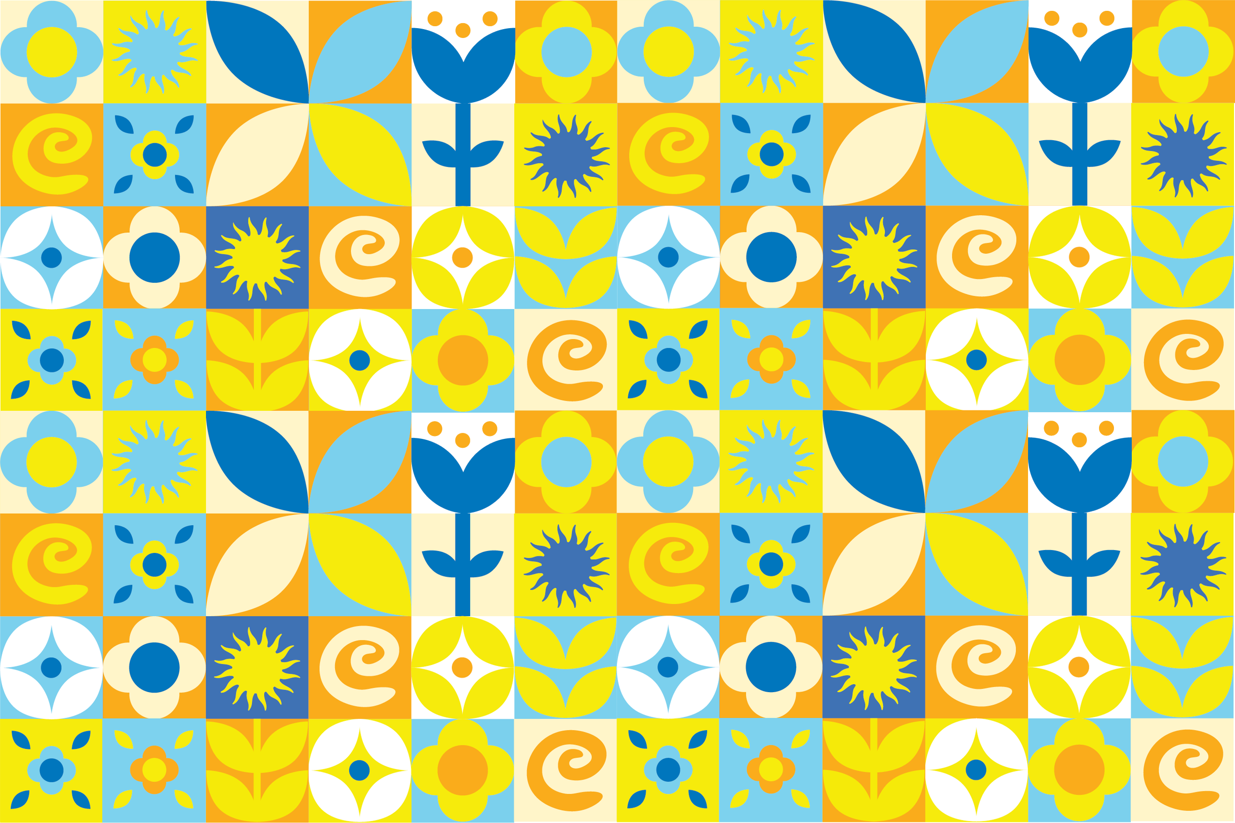
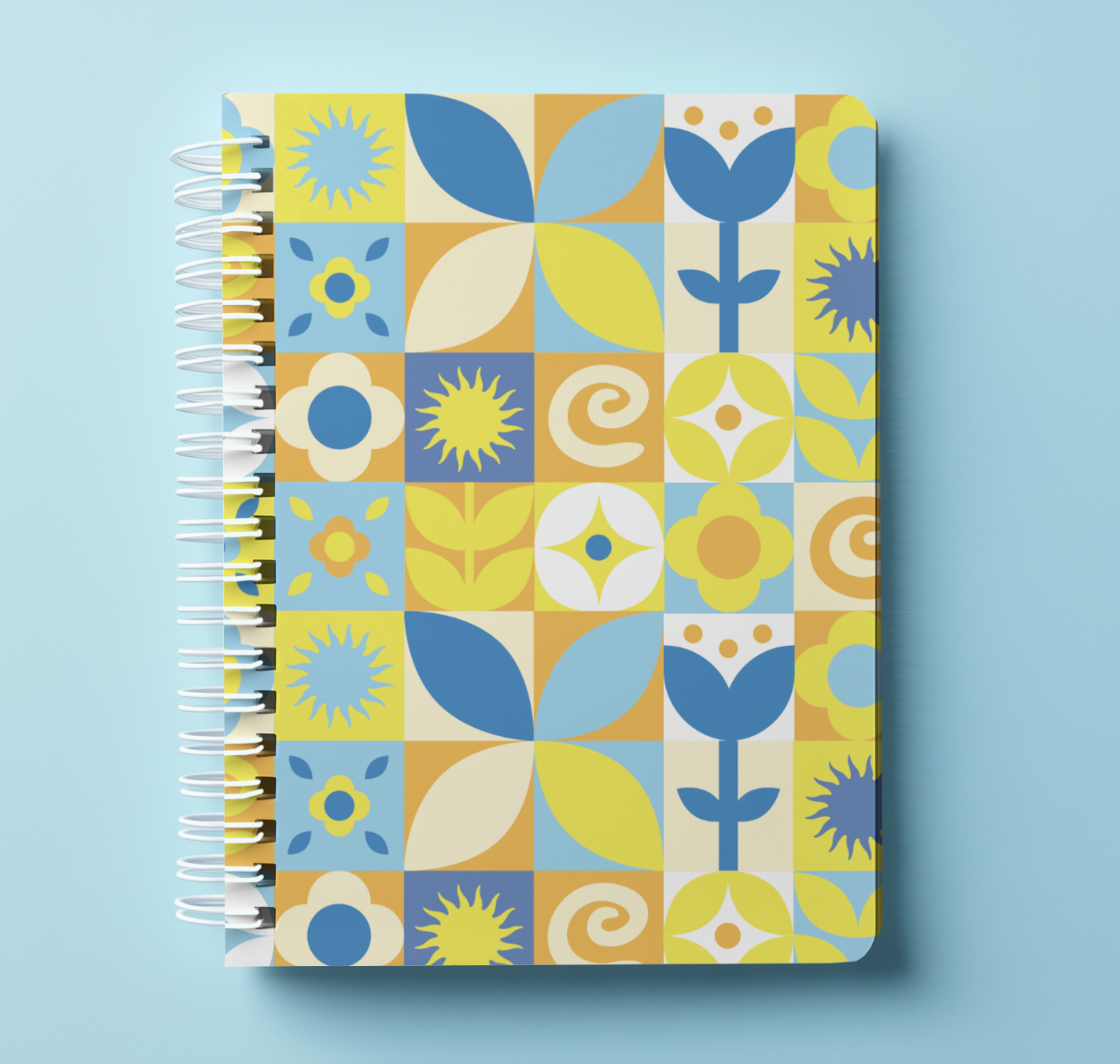
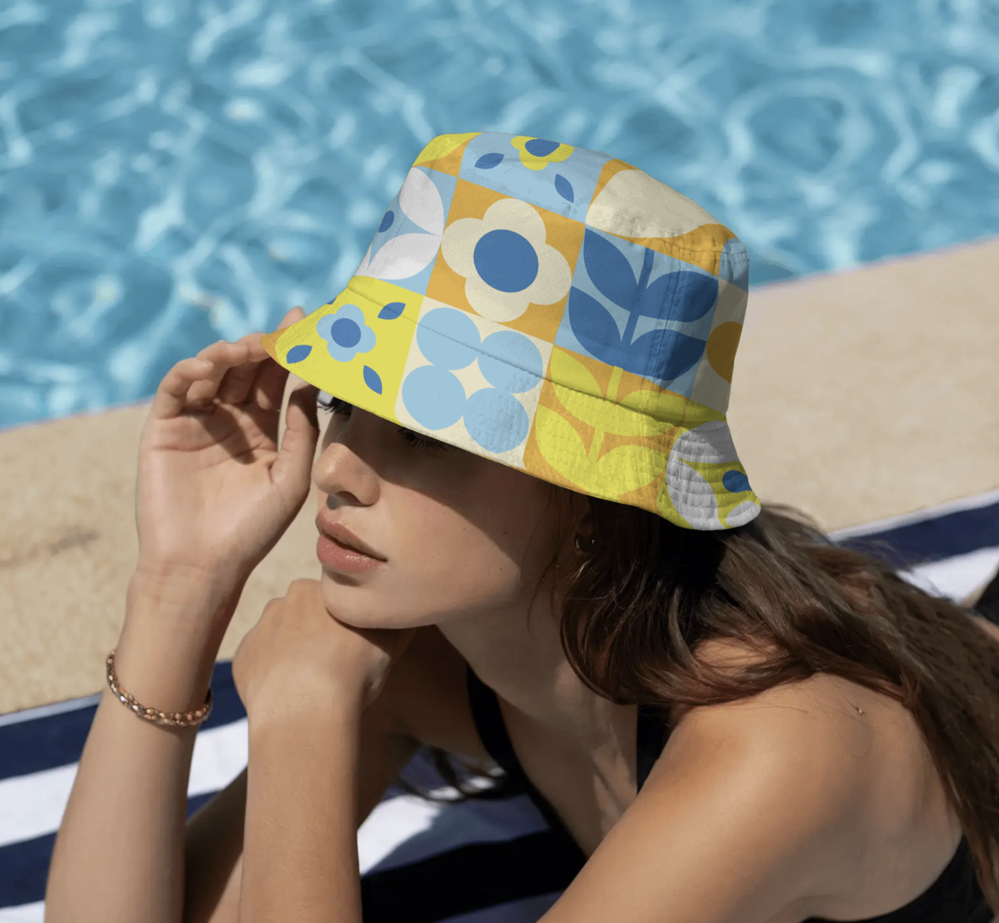
Brand pattern
Bottle design
TOOLS
Procreate
Adobe Illustrator
Adobe Photoshop
PROBLEM
Teens and young adults not using sunscreen
I noticed many of my peers and teammates did not apply sunscreen regularly. However, almost everyone had a multistep skincare routine they followed. They were able to consistently do that, but not apply sunscreen before practice. As beach volleyball players, it’s crucial that we wear sunscreen because of our constant sun exposure. When observing most sunscreens available at local pharmacies, the packaging seemed to be designed for kids, or the bottle design was clinical.
How could I design a sunscreen brand to encourage daily use?
THE SOLUTION
Make the product feel personal
The goal was to create a product that feels personal and exciting to use for my targeted audience. Something that could encourage positive long-term habits of applying SPF. Since many skincare routines of young girls and young adults seem to have a playful and mature branding, it was important to match that.
THE BRANDING
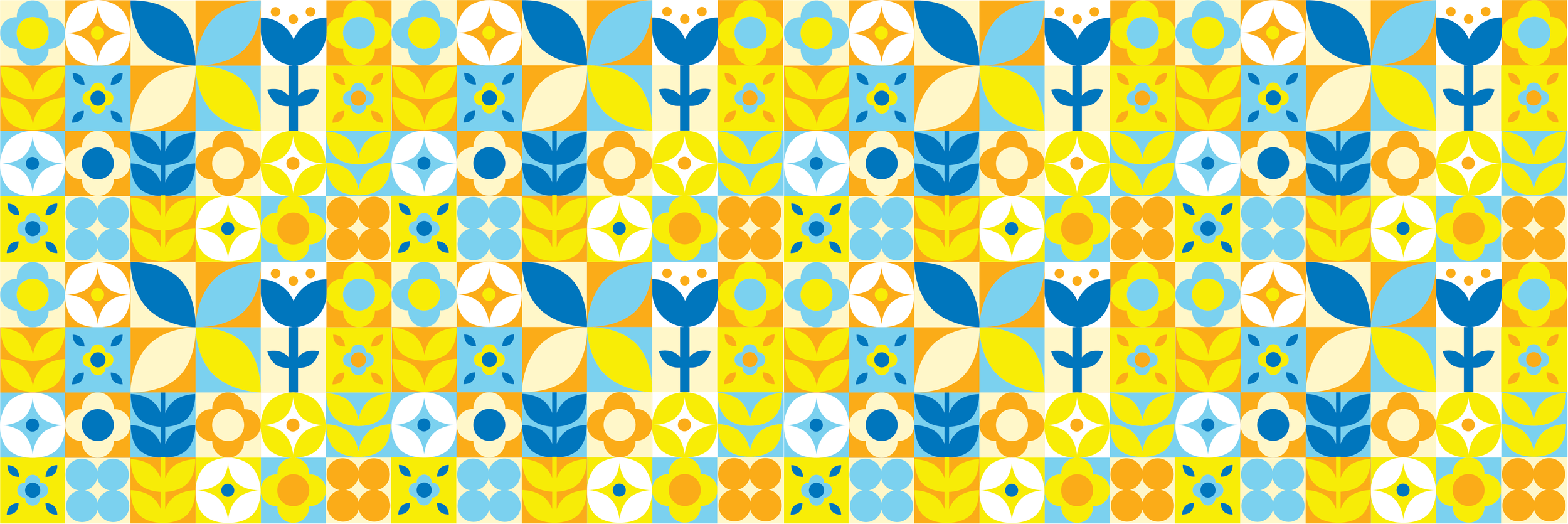
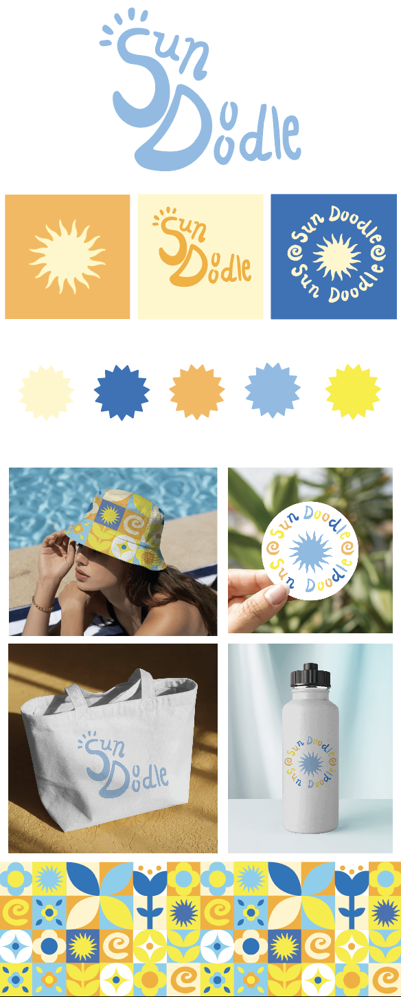
Color Palette

I was inspired by retro patterns when creating my own for Sun Doodle. I knew that I could incorporate many fun shapes and designs to help make my brand more expressive. I incorporated symbols that were in my secondary logo to make it cohesive.
MOCKUPS
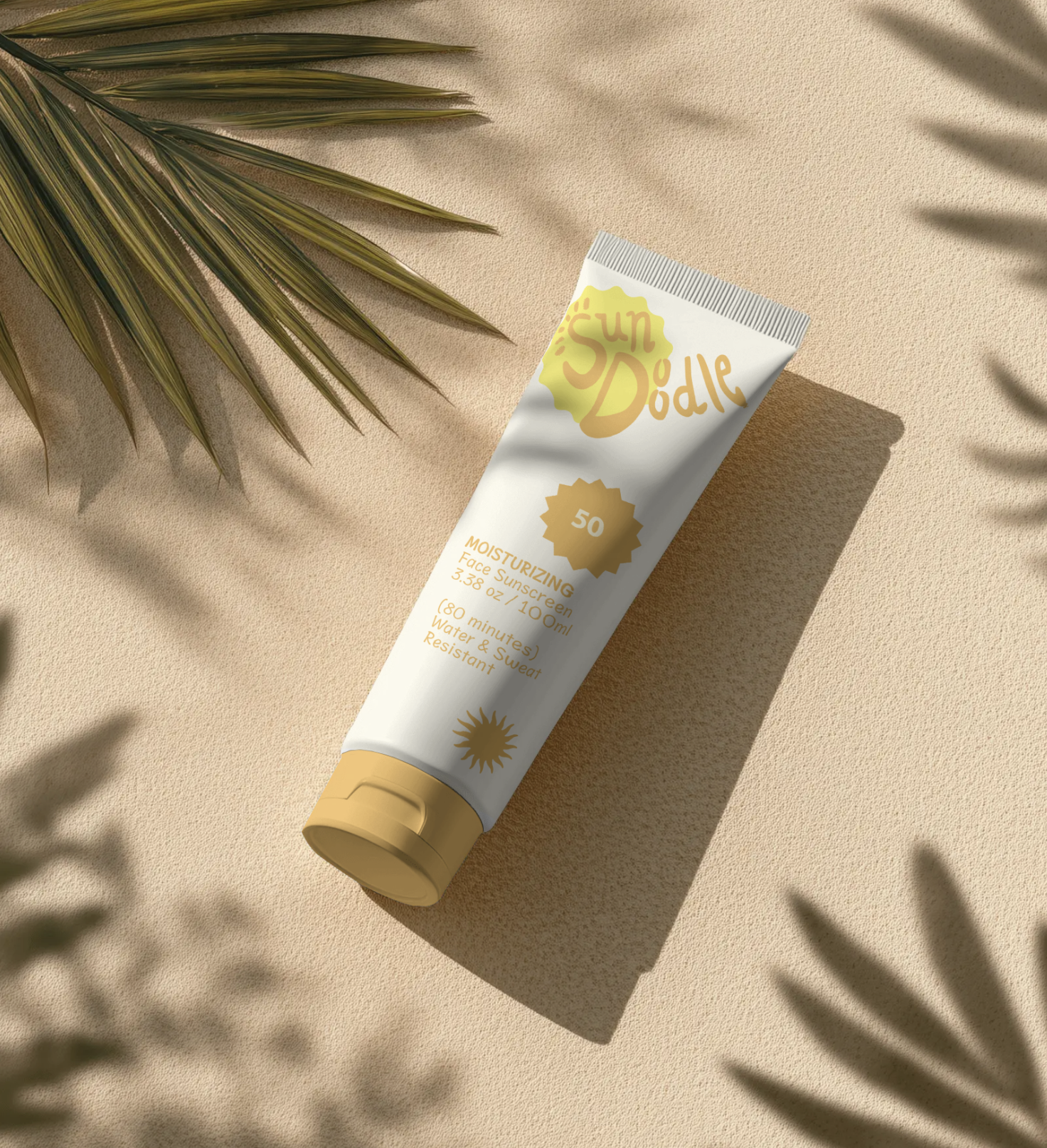
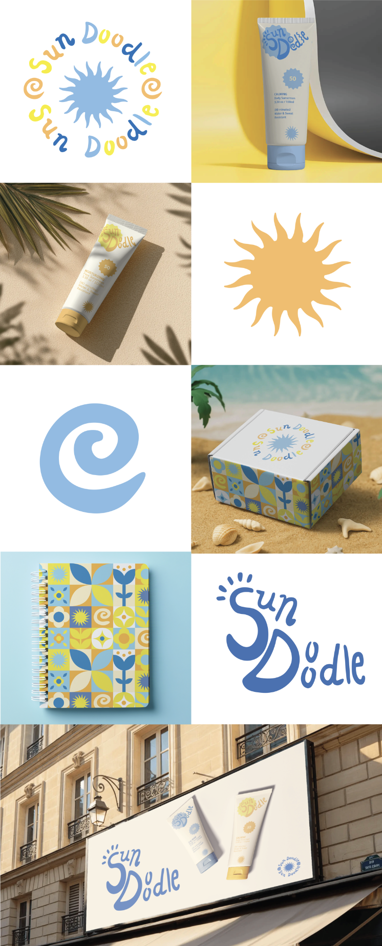
I created two sunscreen tube designs, a face sunscreen and a body sunscreen. I kept the design minimalistic and used two tones for each tube. Using pastel tones for the design was important to appeal to my targeted age group.
Sunscreen tube packaging
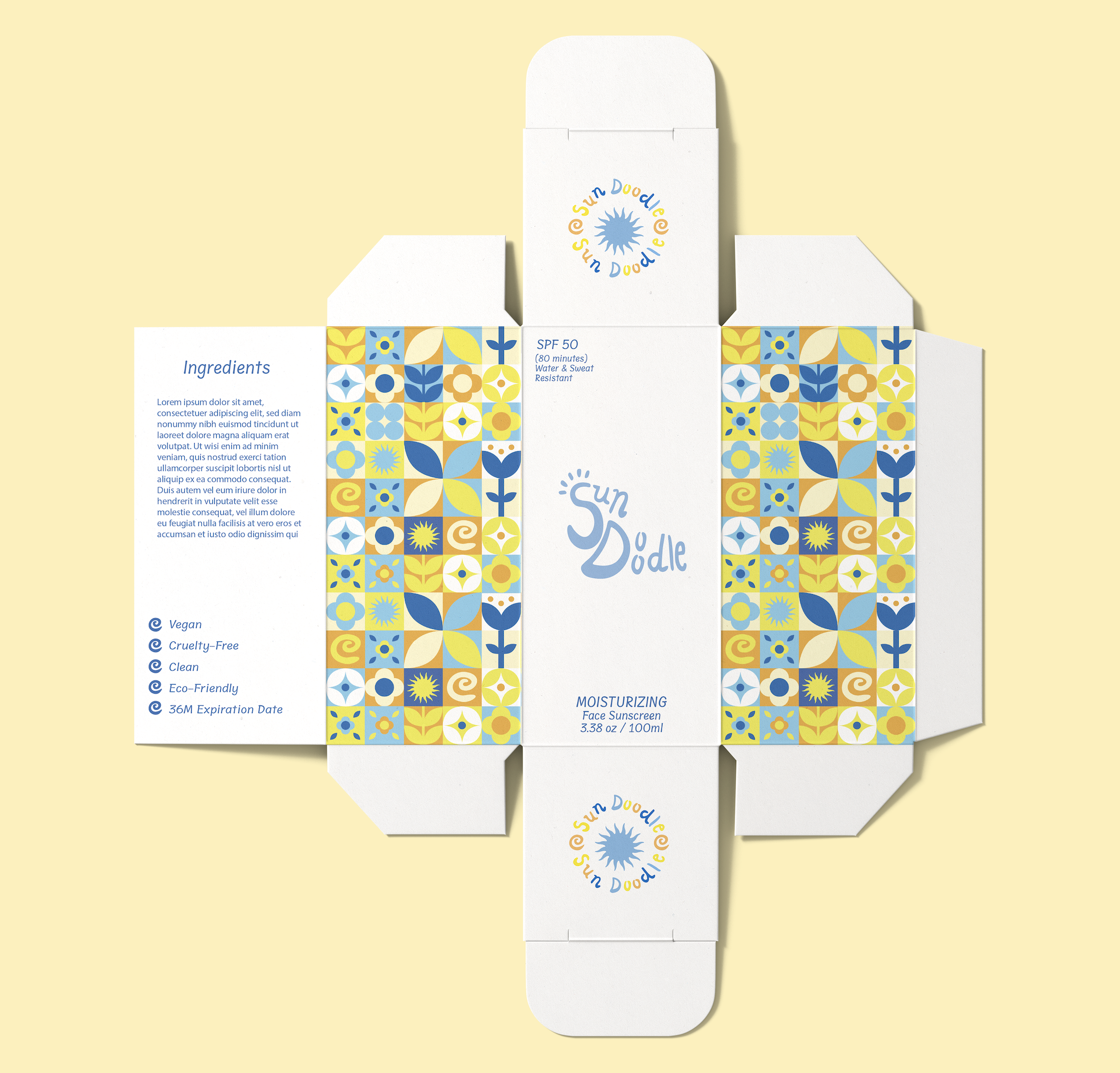
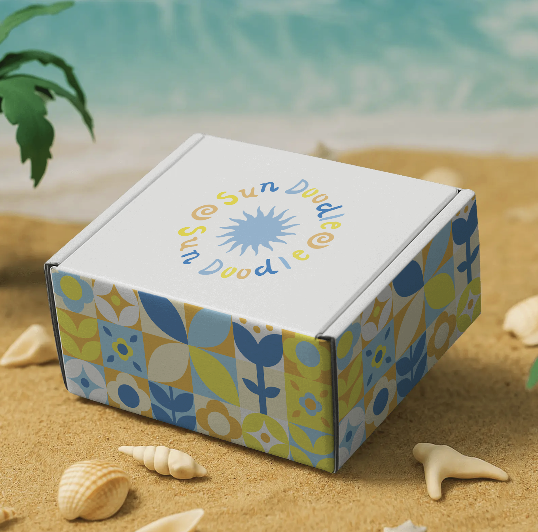
I finally got to incorporate all of my patterns and logos into this package design to create an expressive and youthful container. It was important that I kept the brand name and front of the box simple so that my patterns on the side could shine. I added my secondary logo to look like a seal that could fit the small space nicely on the top and bottom sides.
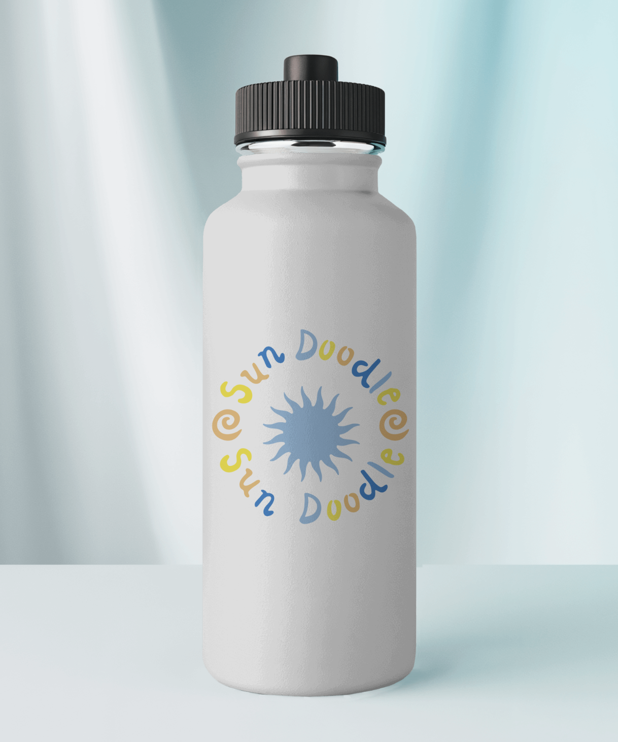
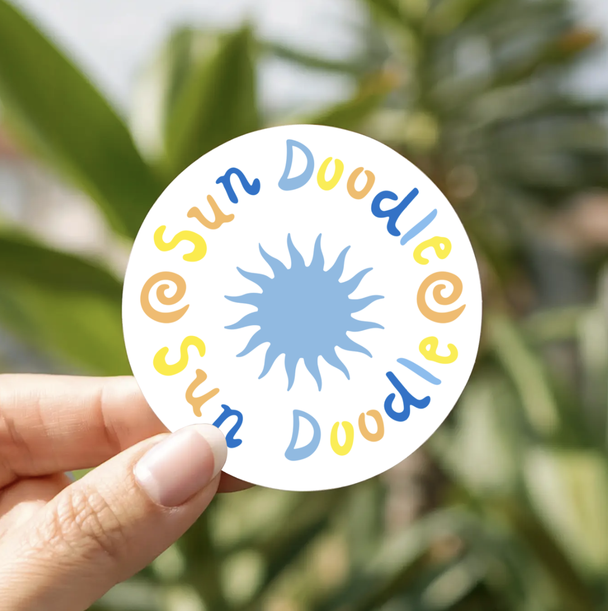
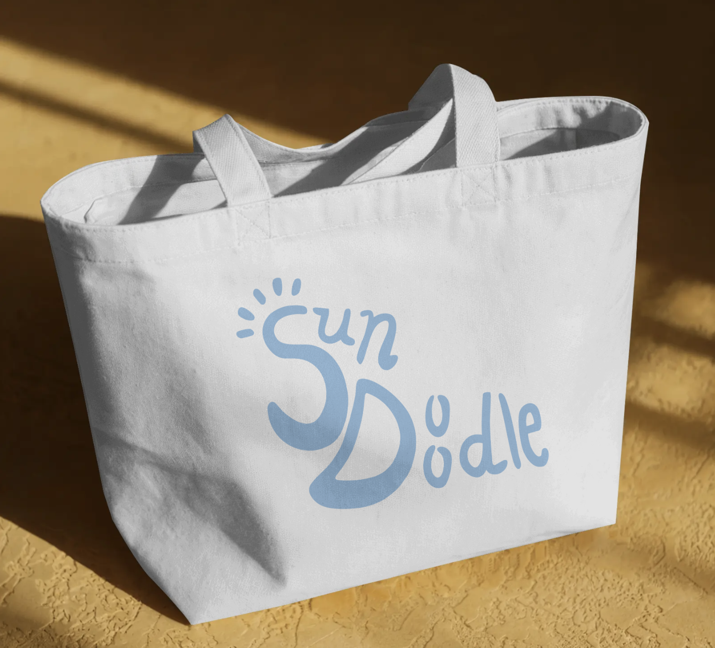
Accessories
TIMELINE
Oct - Nov 2025
I used a color palette that felt beachy but not overly saturated like some kids’ sunscreens. By using some bright and pastel colors, there was a nice balance of tones.
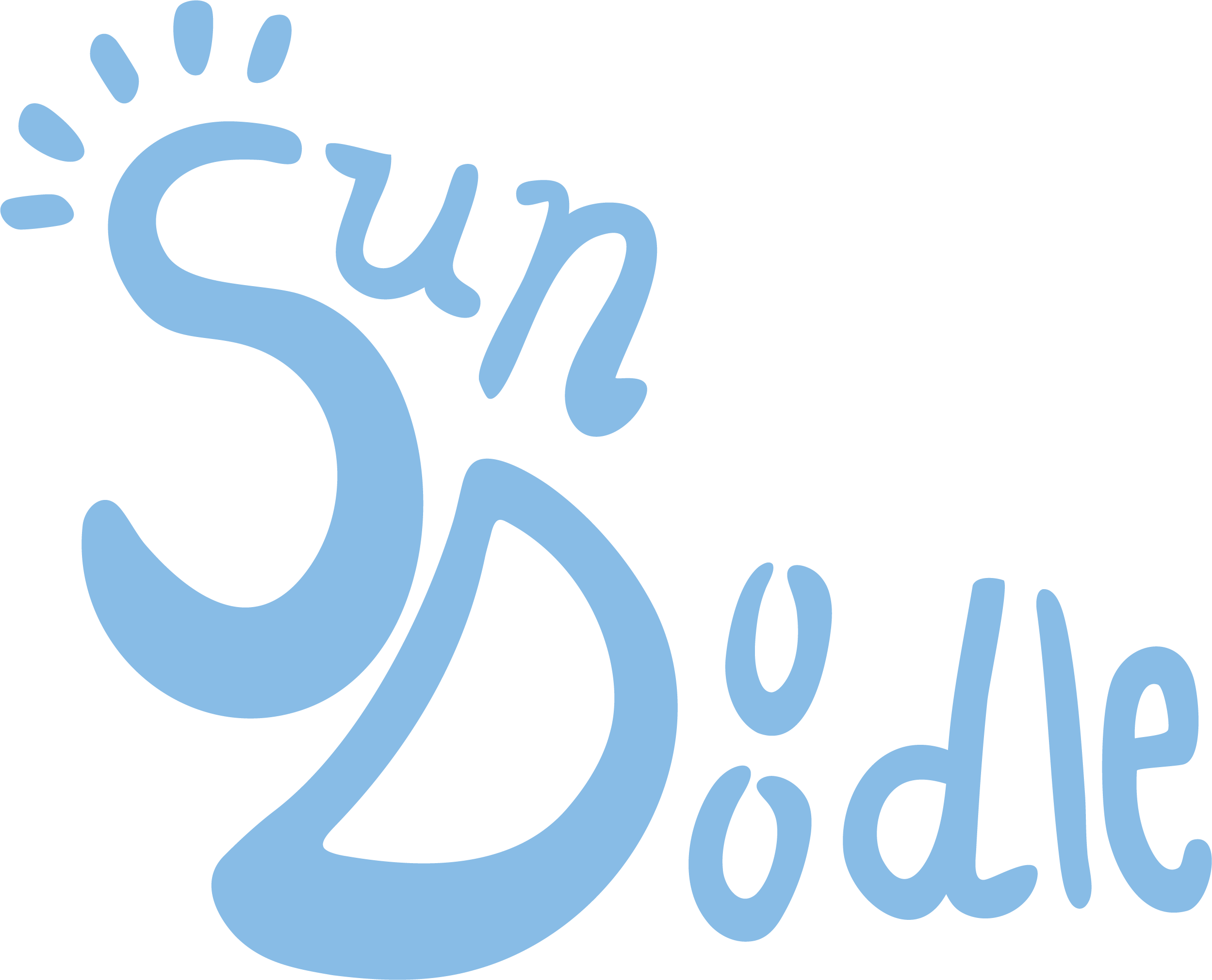
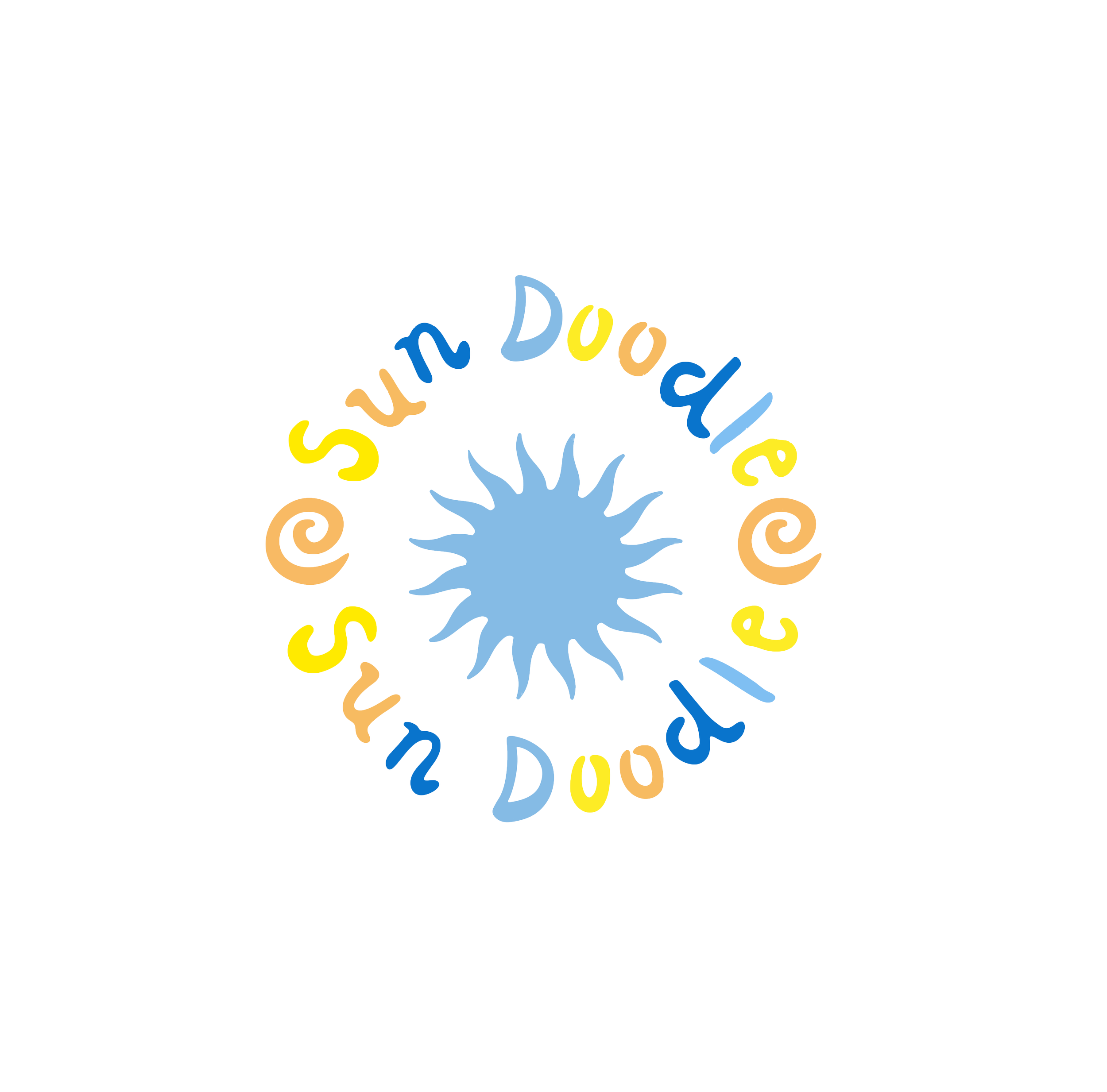
I designed a primary logo using the pastel blue for all of the letters. I drew all the letters by hand and added sunbeams to the S to make it playful. I then created my secondary logo in the shape of the circle and used more colors to and shapes to make it even more playful. The secondary logo was designed to go on the top of my packaging containers and other merchandise items.
Brand Posters
PR box packaging
I designed a PR box for the sunscreens to go in as a shipment box. I wrapped the pattern around the sides and used my secondary logo as the cover for the box.
Thank you for reading!
ROLE
Solo project
Graphic Designer