Making diving more predictable.
TIMELINE
NAVIGATION FOR DYNAMIC ENVIRONMENTS
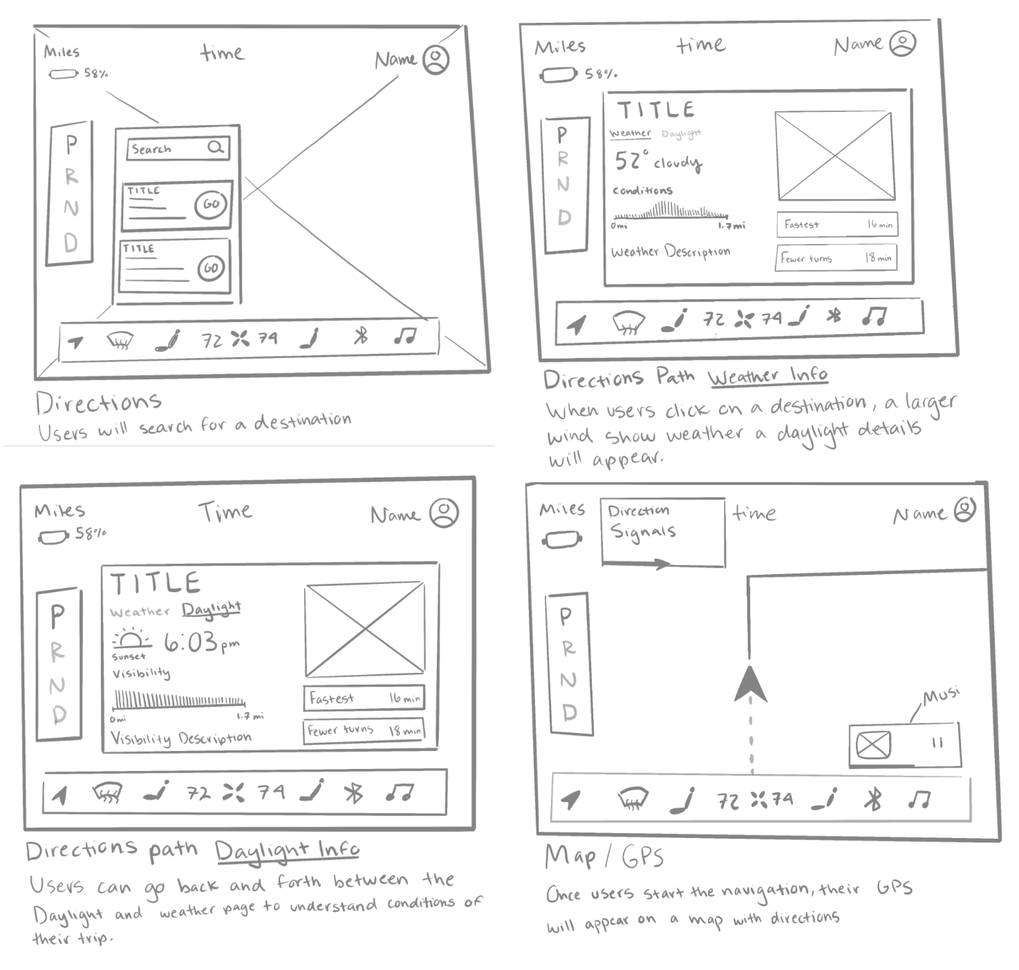
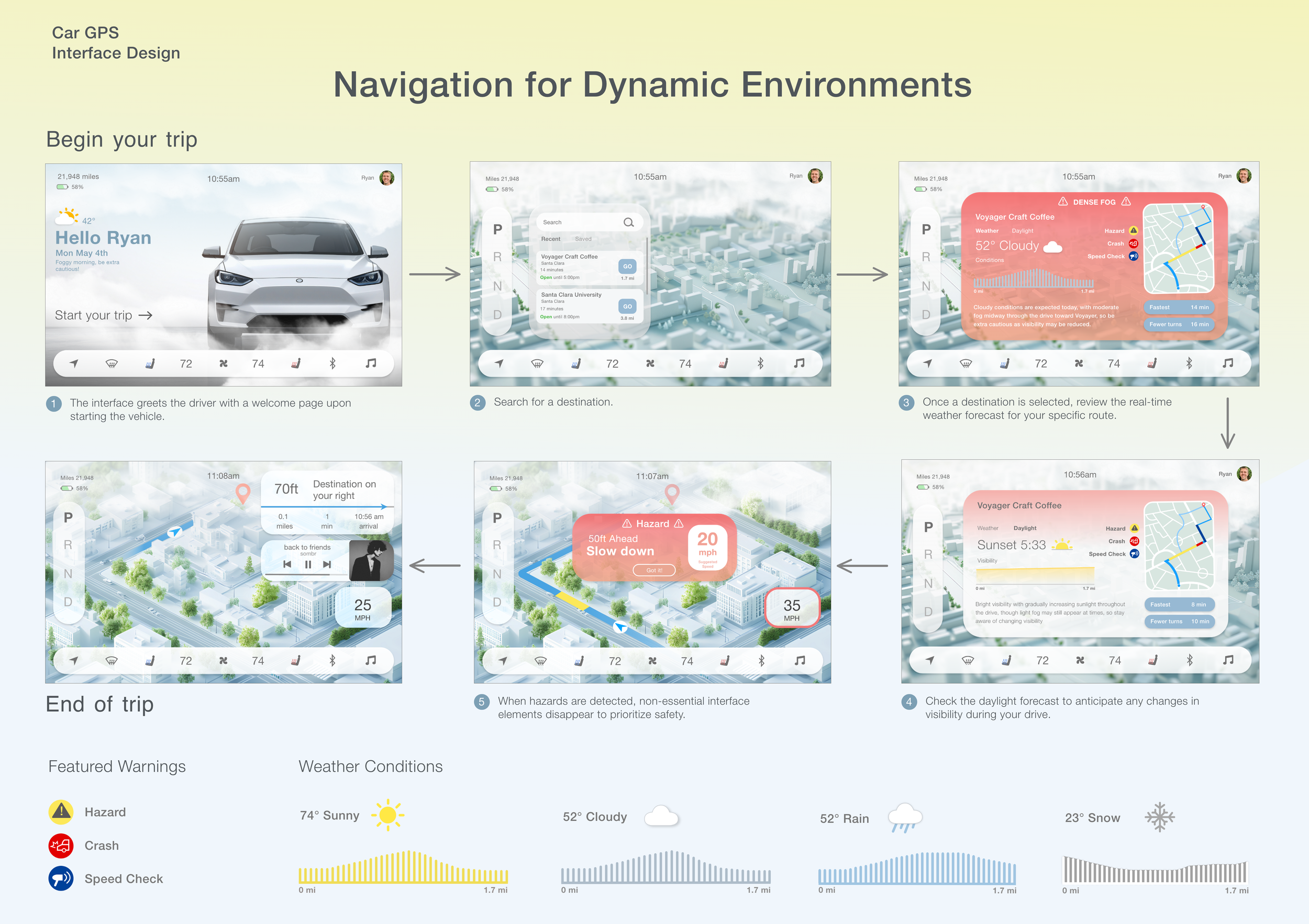
I started by sketching the four main wireframes for my navigation pages and implemented a consistent navigation bar visible on each page. I wanted to keep the background image visible at all times while the user navigates through each page, preventing any confusion so that my user does not feel lost.
ASSETS
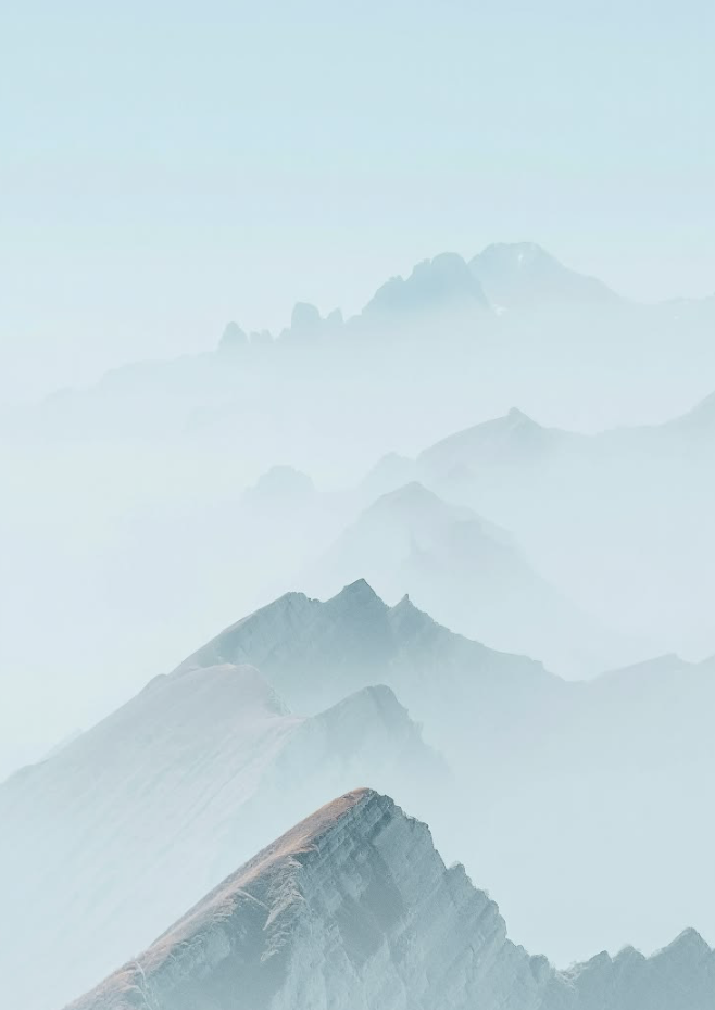
Mood board
For my color palette and feel of the design, I drew inspiration from translucent and pastel tones. The goal was to make the widgets and control panels have a translucent appearance reflecting the look of glass. The user should feel more connected to the actual environment and weather conditions through a display that has a relaxed mood. Depending on the weather for the day, the goal was to have the Navigation display mimic the outside conditions.


First Prototypes
Final Design
REFLECTION
Final Thoughts


I experimented with different Image backdrops for my pages and tested how color choices affected them. Initially there wasn’t much sync between the pages with a constant design style. Some colors contrasted my pages too much while others didn’t provide enough contrast with buttons and text colors. Getting feedback from my class helped me pin point some of these areas to adjust.
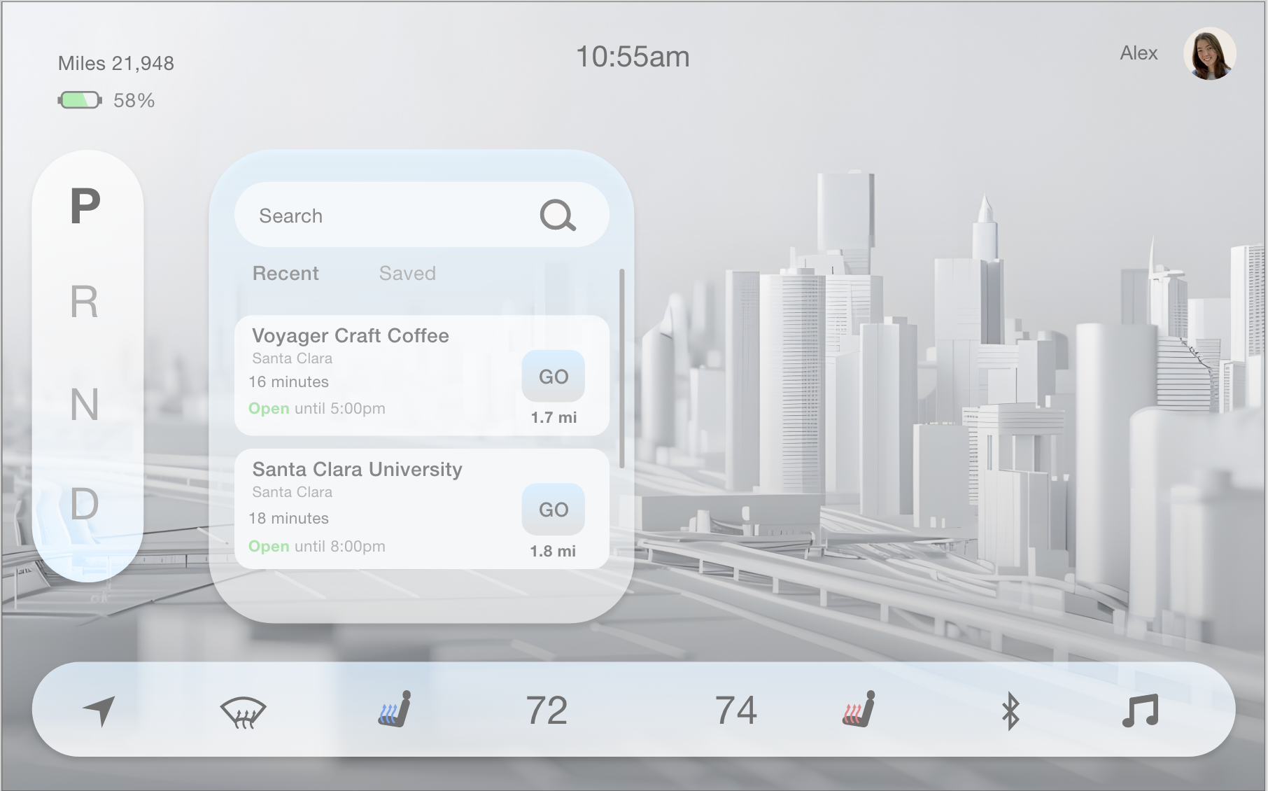
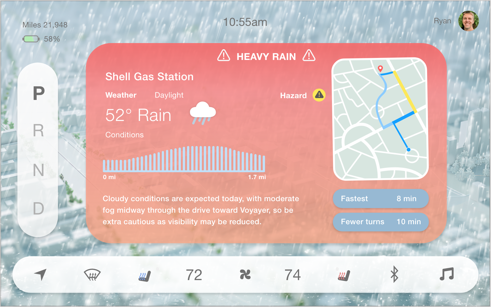
Directions Search
Initially, the colors were too minimalistic and washed out, and the text wasn’t distinct enough in the search section.
Weather Conditions
TOOLS
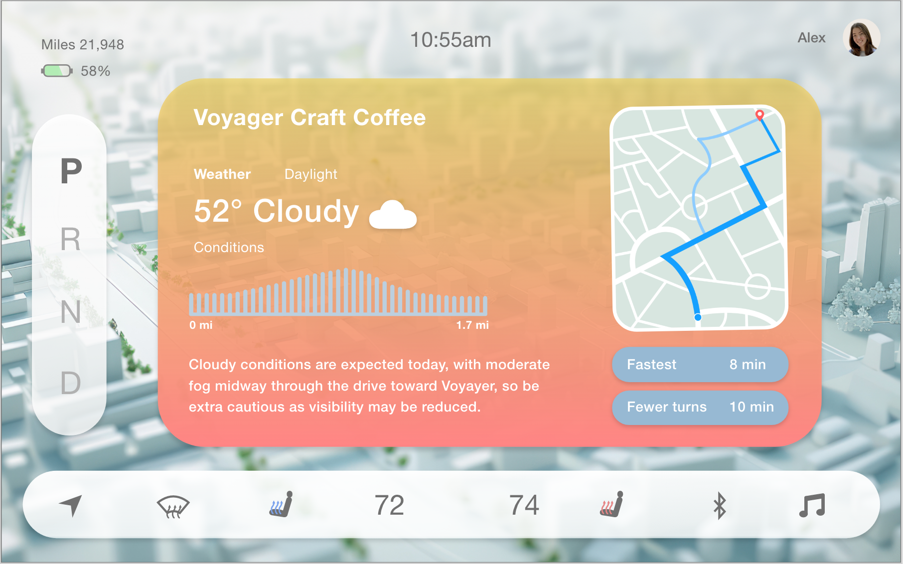
Weather Insight
The navigation box was overly saturated with too many tones compared to the background.
The use of only whites for the gears and bottom control bar paired better with the background image.
I created a variation of different weather scenarios, ranging from a regular sunny day to more extreme weather conditions. Each screen displays a different background mimicking the current weather outside for that day.
Thank you for checking out my work!
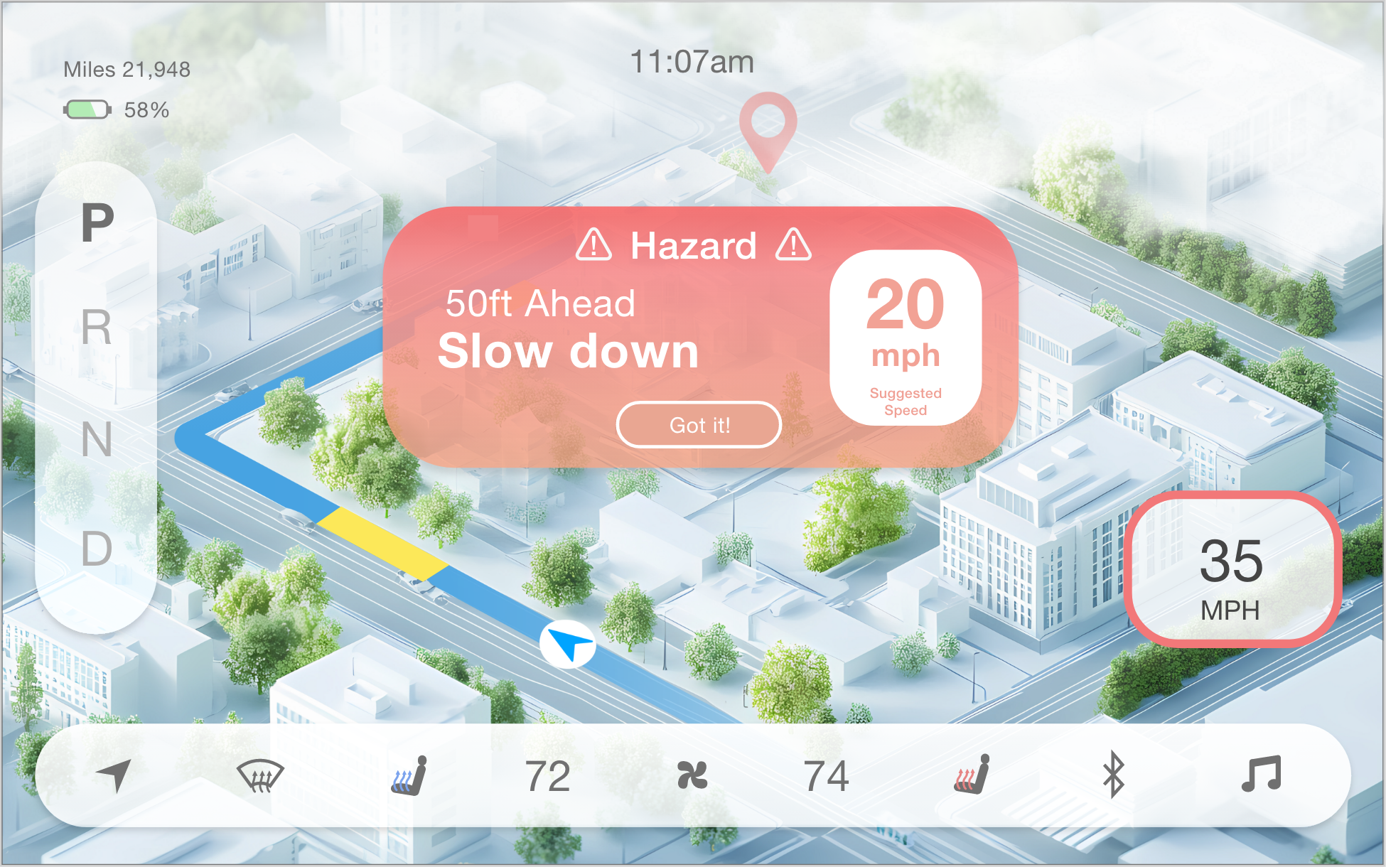
Minimizing Distractions
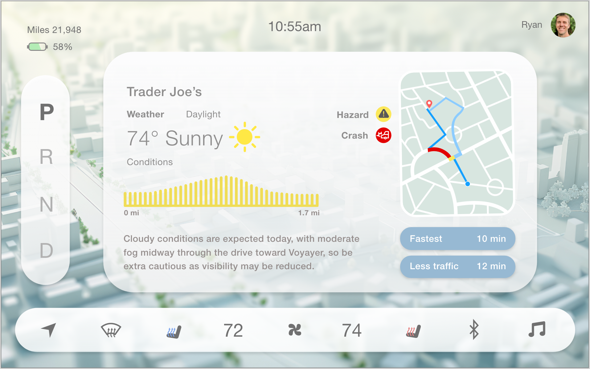
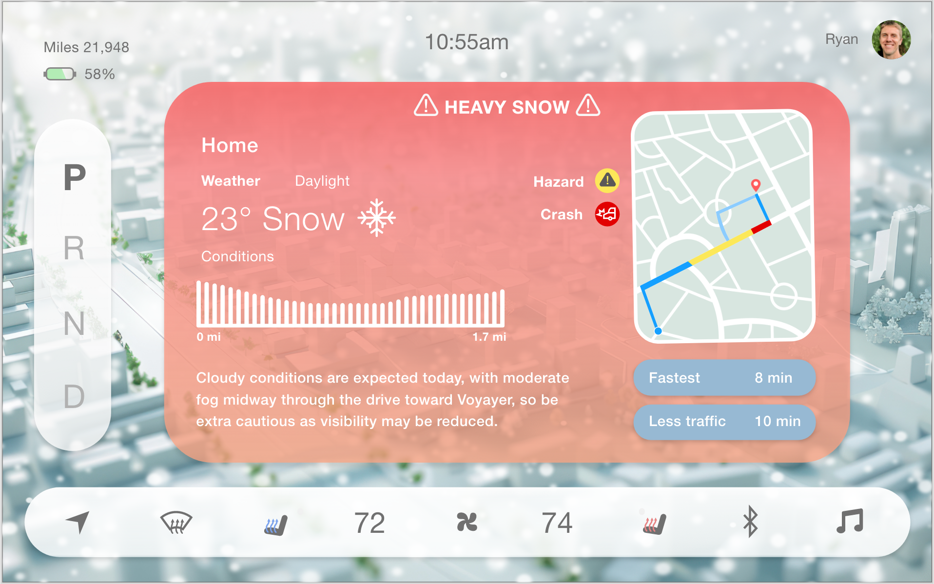
Specific details and a recommended speed will be suggested as a precautionary measure
Removing unnecessary widgets when hazards occur will pause the action of the driver in urgent situations
This will help prevent the driver from missing the notification if they look away from the road

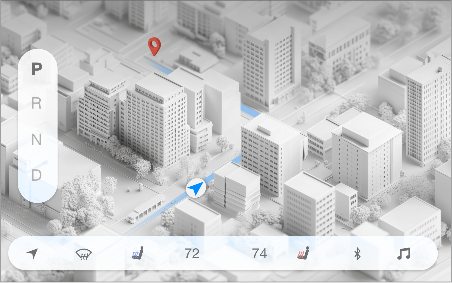
GPS Map
The depth of the map added a more detailed futuristic look, but it was hard to see the full path of the GPS.
The image was too busy to use for a regular navigation map, and made it harder to focus on the GPS.

The final interface design showcases the beginning-to-end journey in the scenario of extreme fog. The Intro page naturally guides the user to start their journey through a friendly welcome page. Each page showcases the weather conditions in the background, which provides a more immersive experience in the car. The user will be notified about hazards throughout their journey to create a safer and more predictable trip.
When designing a car navigation system, I learned that it’s important to have a more minimal design approach to avoid distractions for the driver. Finding the right color palette took lots of trial and error, but keeping my navigation buttons white and transparent made the design feel less crowded. Implementing different weather conditions in the background helped make the design more immersive and connected to the outside atmosphere.
This project taught me a lot about trying to design for a large age range of users who have all different levels of comfort when driving. It was important to make it feel accessible for people who may have visual impairments who rely on more cues from their navigation. Providing weather and light insights may not be a need for everyone, but it gives users the option to view the conditions if needed. Even when driving may feel like second nature, no one can fully prepare for the extreme weather advisories that can surprise them during their drive.
Jan - Mar 2026 8 weeks
ROLE
Solo Designer
Adobe XDAdobe Illustrator
Background Image of car: © Sutipun/ Adobe Stock (Generated with AI)
Background Image for weather/light info page: © Daniil/ Adobe Stock (Generated with AI)
Background Image for GPS page: © Thiago/ Adobe Stock (Generated with AI)
Interface Design: Original UI/UX work by Alex Franklin.
Noticing how many of my peers have been afraid of driving due to the weather, or if they will have enough daylight to safely drive home, is what drove me to rethink car navigation features. Some people experience hesitation to leave their house because of how rappidly weather can change throughout even short distances. Designing a modern navigation system that can give users the information and warnings they need will help them feel safer on the road.
THE PROBLEM
Unpredictable environmental variables while driving poses saftey risks.
There can always be unexpected changes in weather or light through the course of a user’s drive, especially during different seasons. While users can get a glimpse of the weather forecast for a single location, it’s difficult to see how that may change throughout the user’s drive on stormy days and bipolar weather conditions. Stormy days can be scary to drive in for some users, but unexpected weather can surprise any driver without being able to adequately adjust their speed in time. This can lead to more accidents and drivers feeling more hesitant.
How can we notify drivers ahead of time?
THE SOLUTION
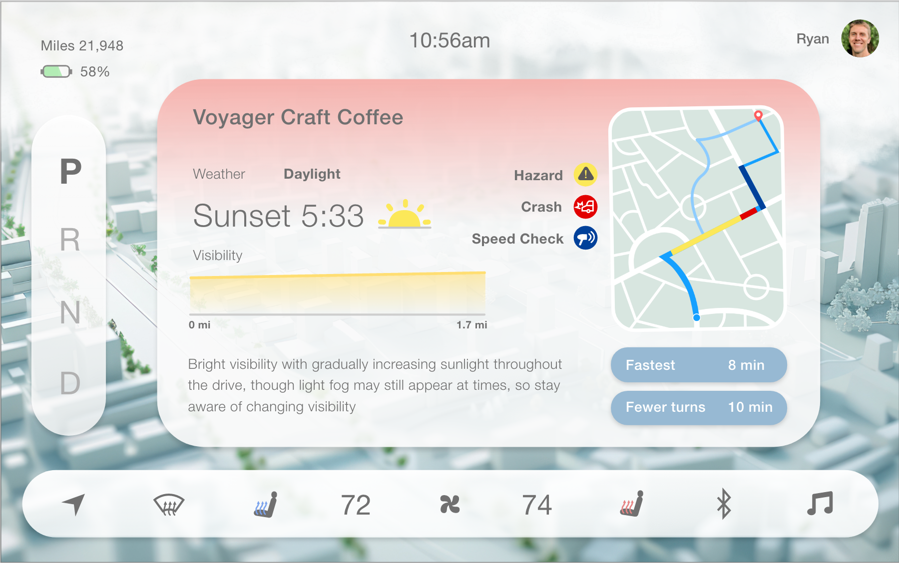
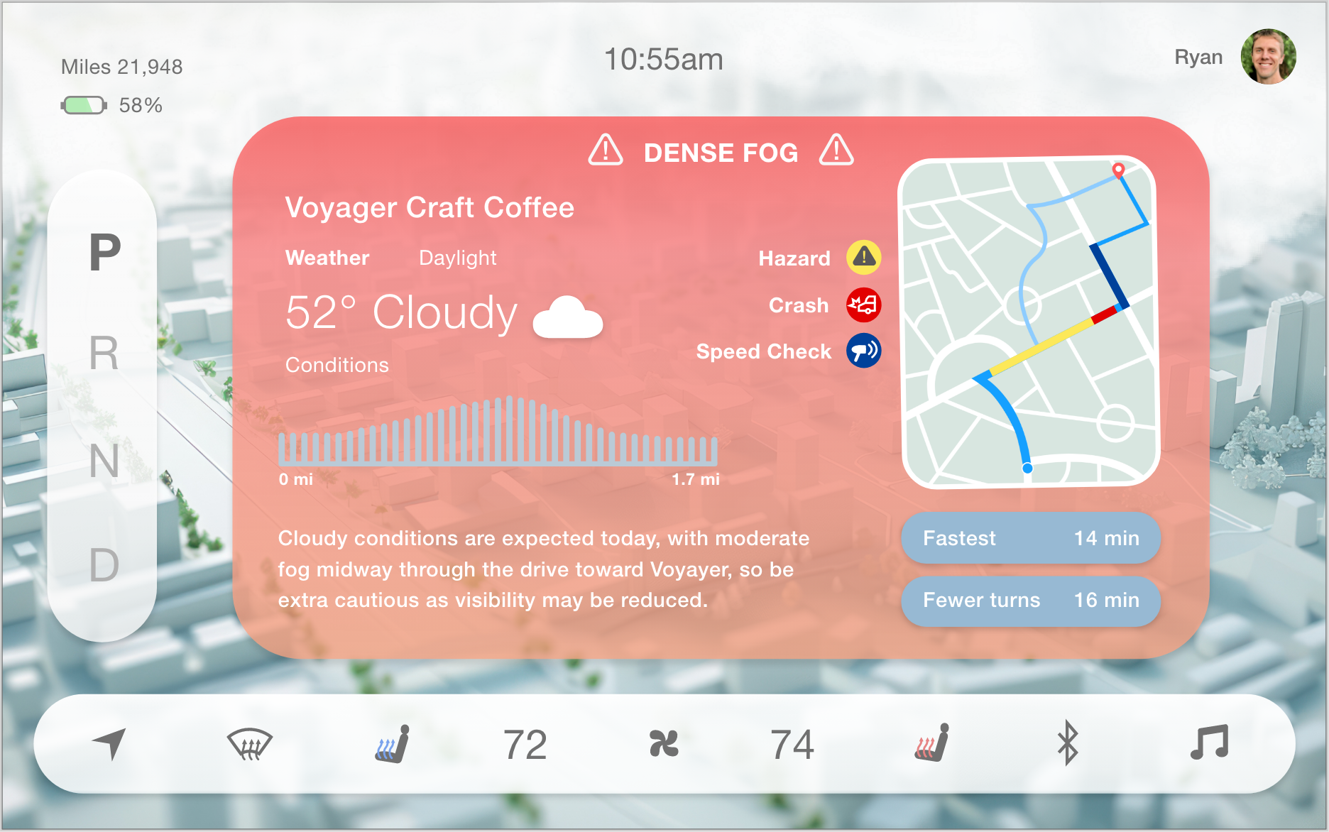
Include weather and daylight conditions for specific paths.
Light Visibility
A daylight section will also show the conditions through a graph.
A description of what to expect will appear as well, with the sunset time.
Users can then choose what route they want to take, with icons showing warnings to keep in mind.
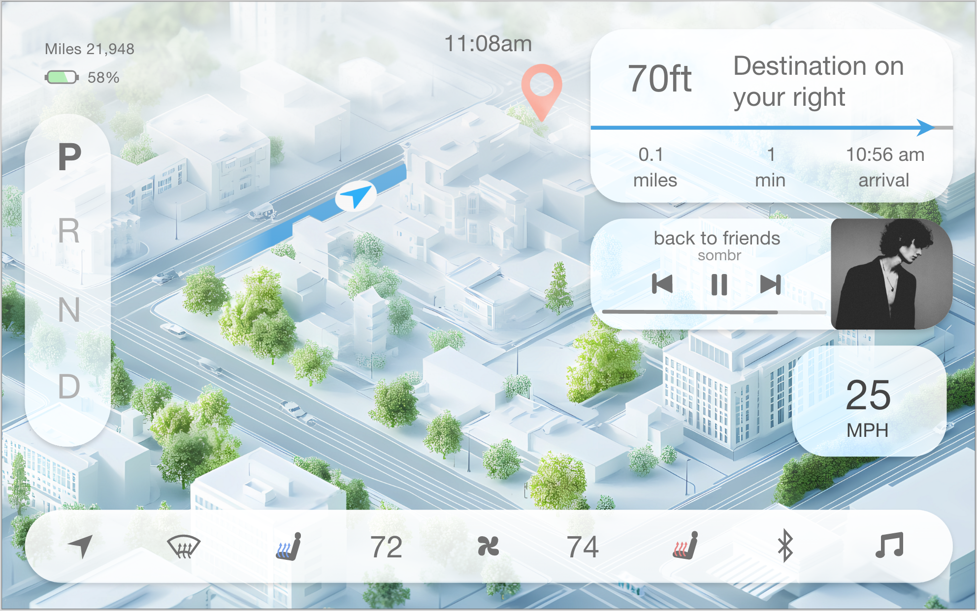
Simplistic Widgets
Keeping the interactive features and colors minimalistic created a clear view of the path and GPS.
Music and directions will appear again after the hazard has passed.
The path will fade as the GPS moves closer to the user’s destination.
Initial Wireframes
Weather Graph
Clicking on a destination will not only show that map with suggested routes, but a weather graph will also show the driver how the conditions will change throughout the trip.
In severe weather, the background will shift color, showing the hazard to watch out for at the top.
A description of the condition will also appear with more details and suggestions.