
Friends of the Urban Forest Non-profit Website Redesign
Connecting Users Through an
Organic Digital Experience.
TIMELINE
Jan - February 2026
(6 weeks)
ROLE
Solo designer
TOOLS
Adobe XD
Adobe Illustrator
Procreate
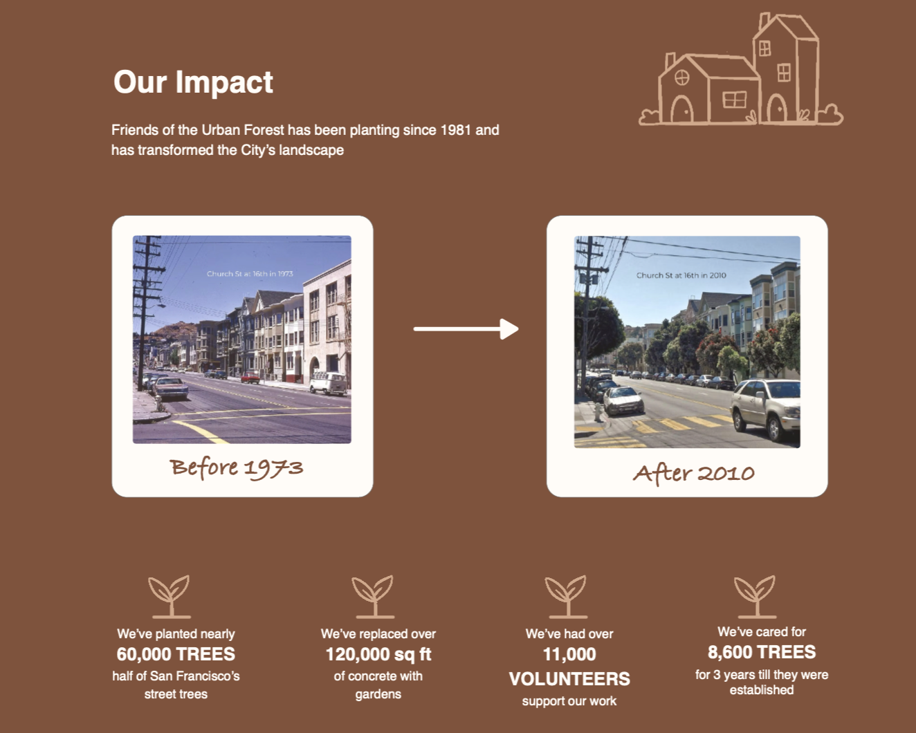
Friends of the Urban Forest is a non-profit who’s mission is continuously growing. Their website should also reflect that same vibrant community of volunteers and the incredible greenery they plant for their neighborhoods. My goal was to help users feel more connected to the gardening they do by experiencing the greenery through an immersive organic experience.
THE PROBLEM
Users struggle to find information in the large navigation menu on the Friends of the Urban Forest Website, along with their search bar that covers the page content making reading content difficult which leads to frustration.
THE SOLUTION
How can we eliminate user pain-points while also implementing a stronger brand identity?
Simplifying is Key
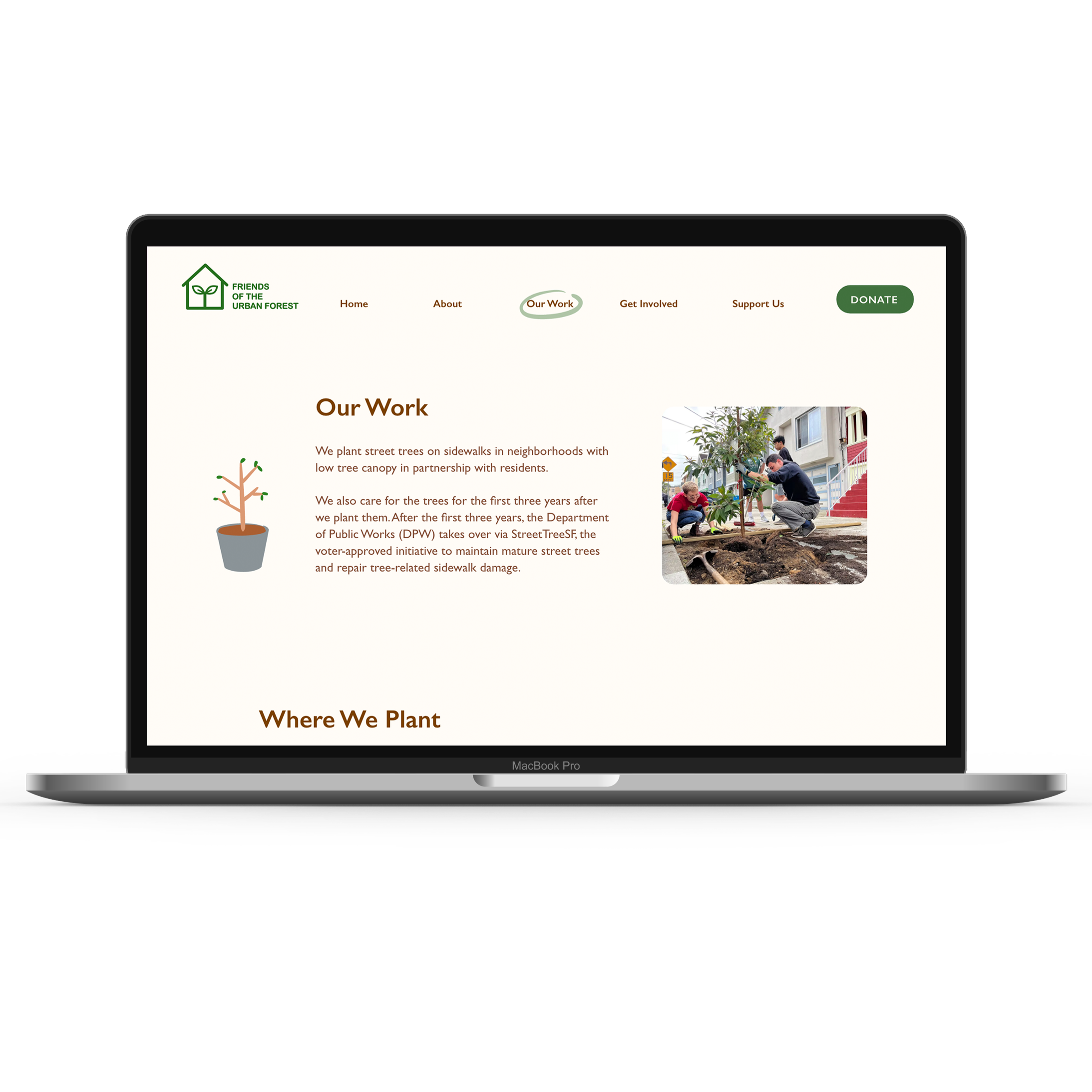
Broke up Heavy Text
Project Summary
Final Thoughts
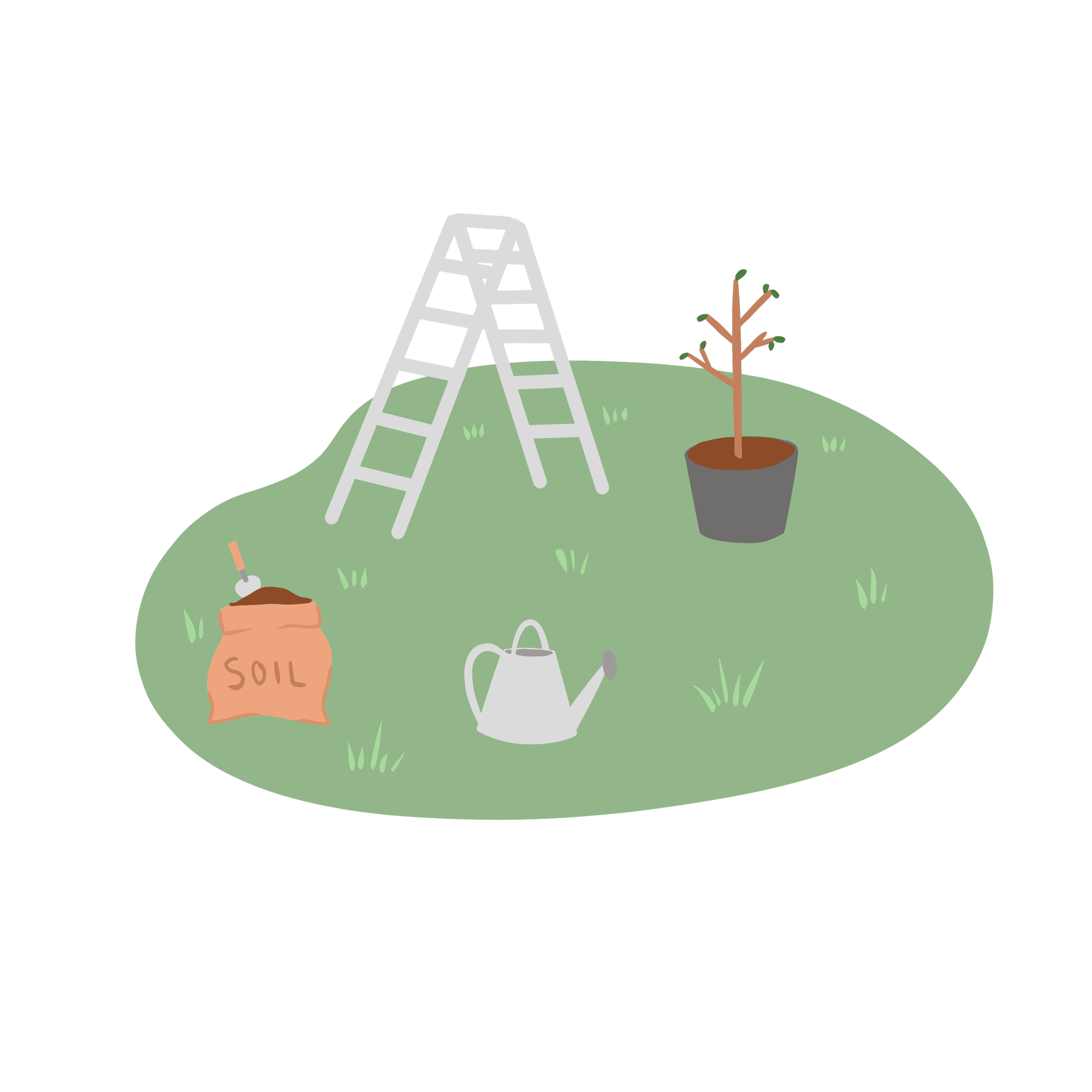
Creating a playful approach
Condensed Headers
Reduced header links for small categories
Combined drop down menus into a single pages
Improved legibility with dense paragraphs
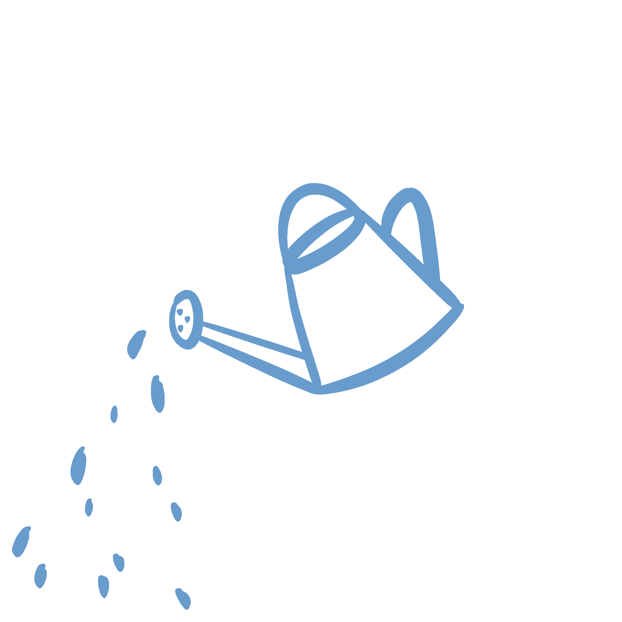
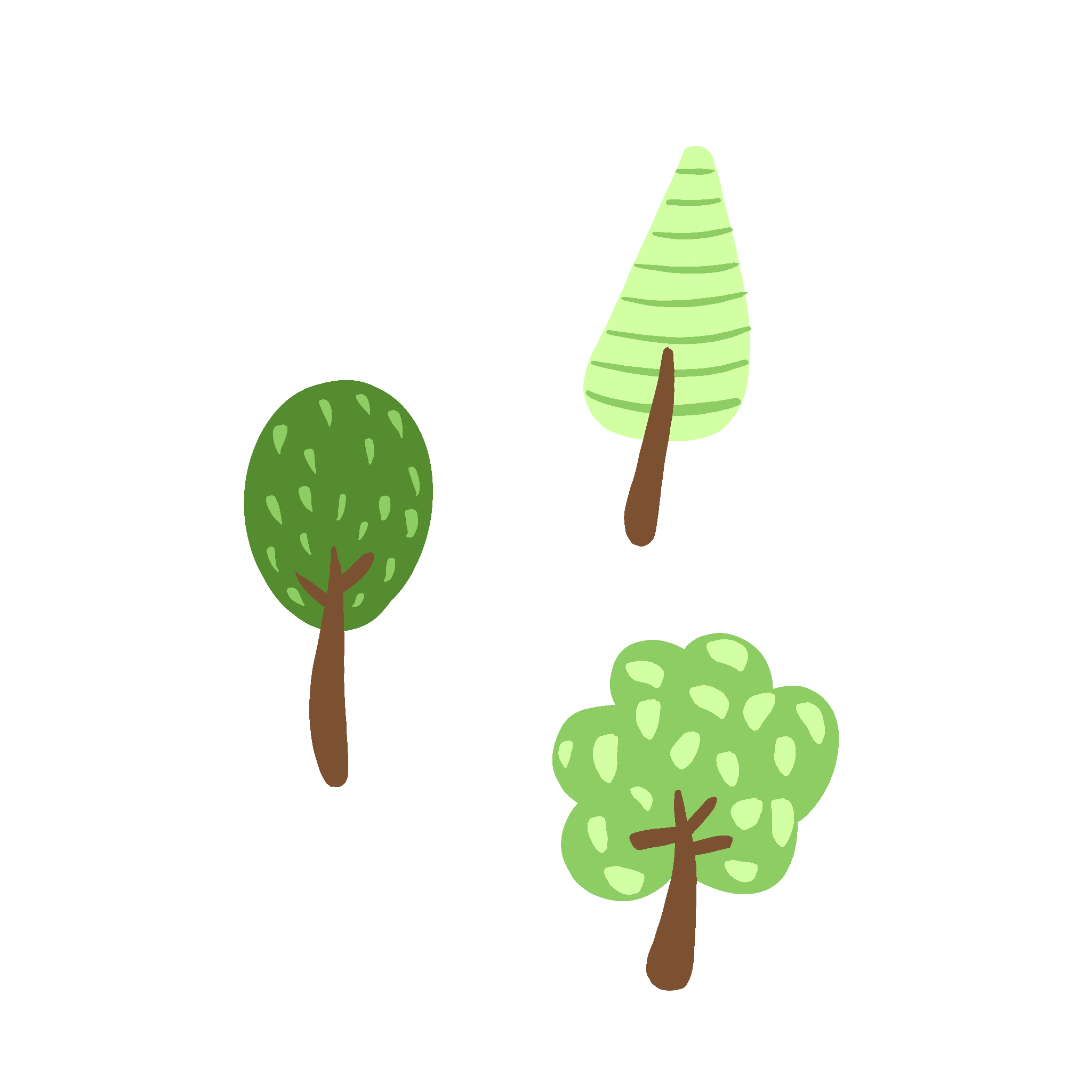
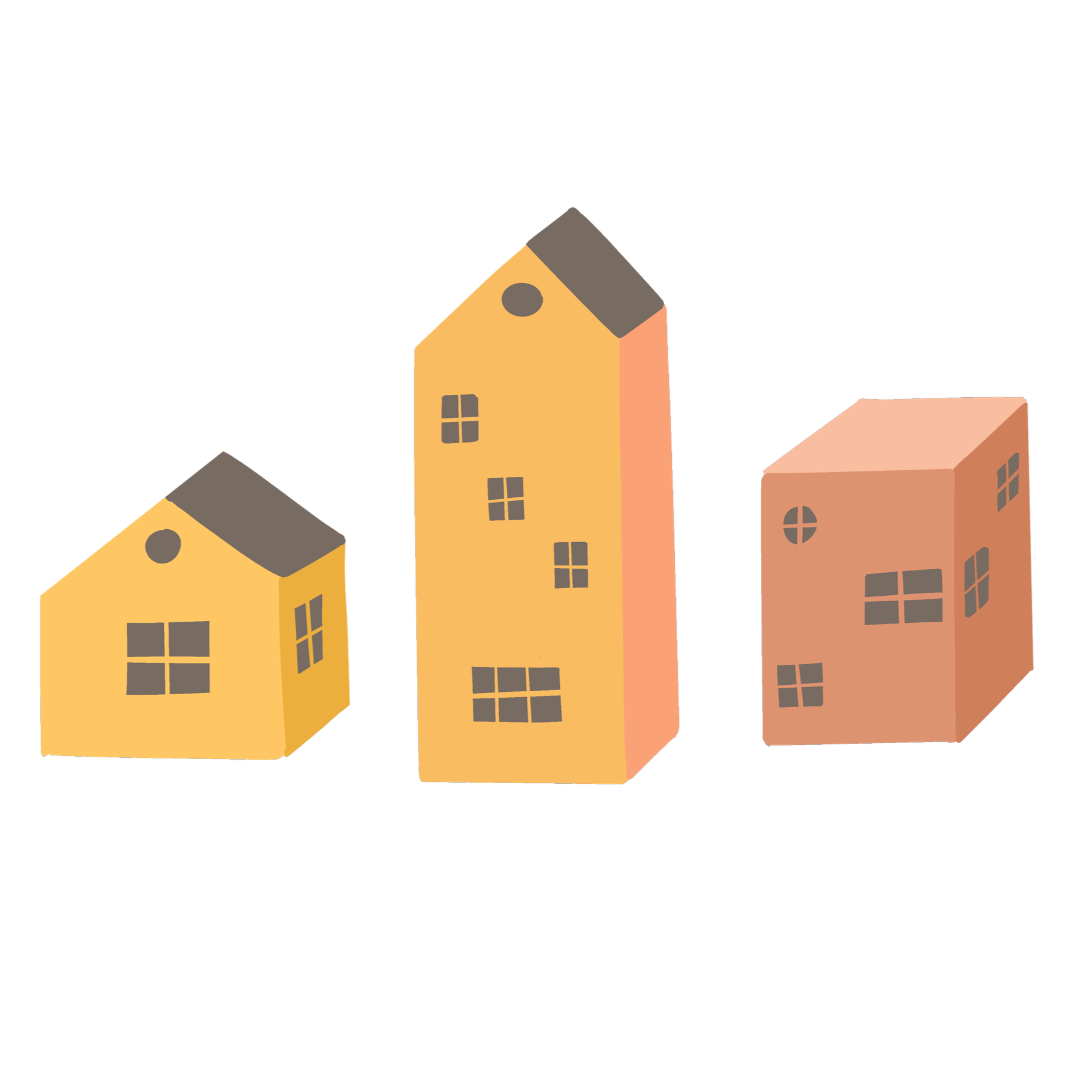
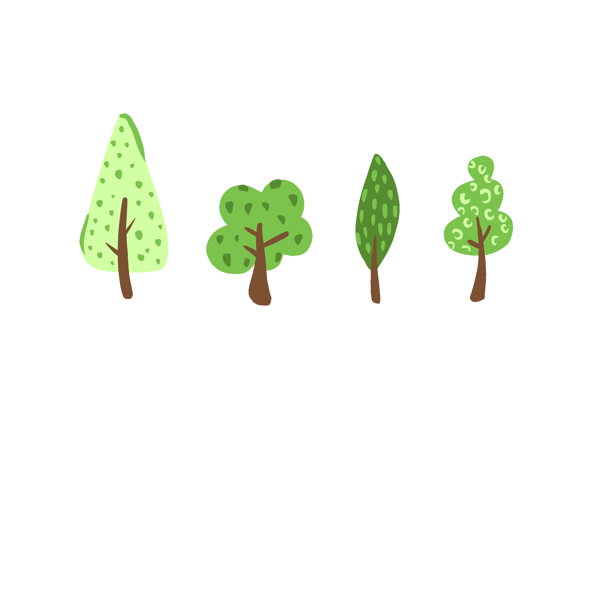
Incorporated illustrations to engage the user
Separated text to clarify information
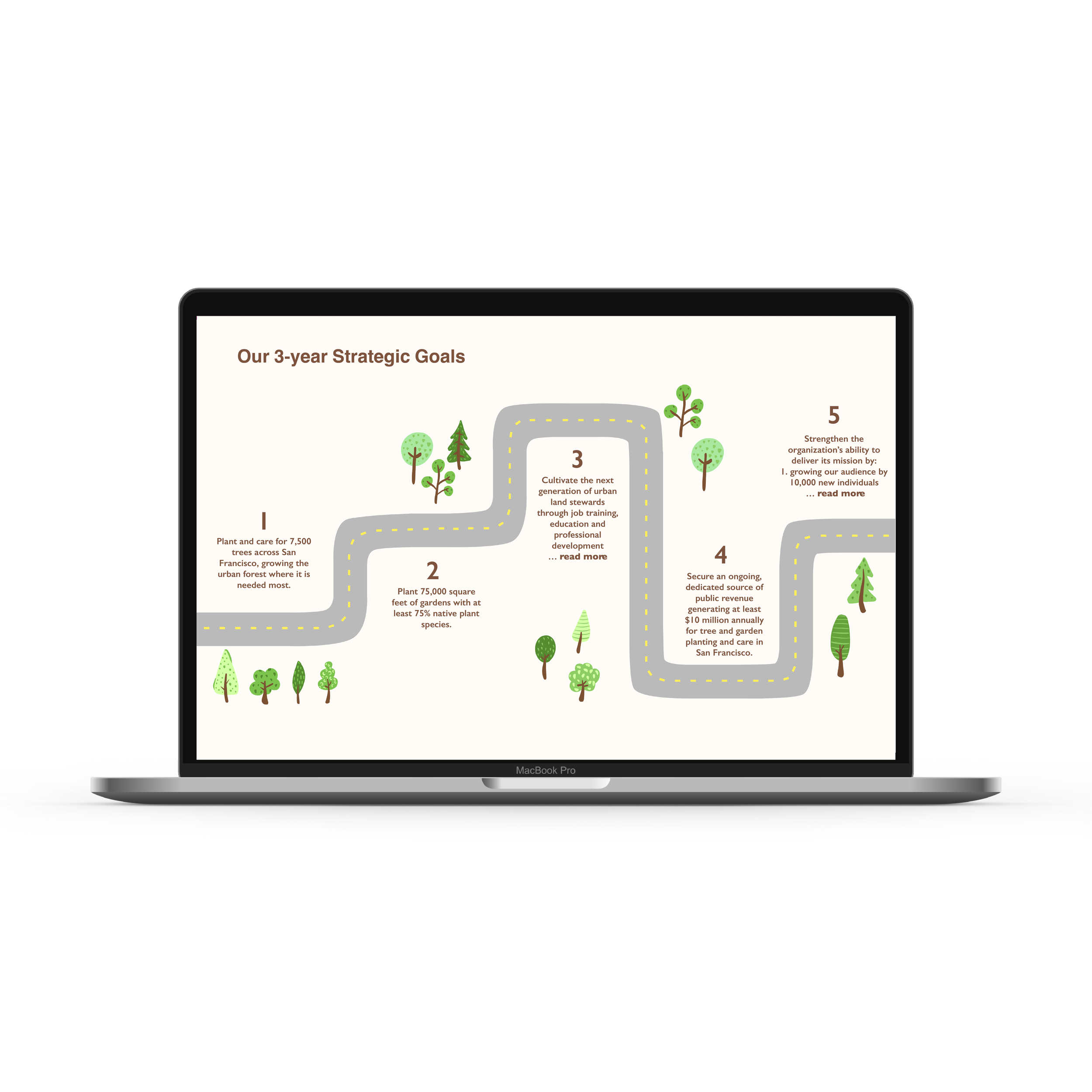
Added a “read more” option to minimize long paragraphs
Creative Brief
Their focus is to revitalize the greenery in San Francisco by planting trees and fun planter boxes on the sidewalks of the city.
They focus on doing this in a community-building approach by planting in teams and working together to fight and address environmental harm
Teach others about how to get involved and their different types of planting and work they do.
It’s also helps share their goal of planting 10,000 trees in the next 3 years and expand their donor base.
The citizens of San Francisco, ages 15-85. Many already go on social media platforms such as Instagram or Facebook.
It would be important to make a web design that can attract more of these viewers.
Viewing the mission, look at photos, or a map of where they have worked.
Clicking on how to get involved or where to donate.
Competitor Analysis
I analyzed two different local non-profit organizations with the similar missions to draw inspiration from their websites.
Strengths
Simple navigation bars and legible and organized pages
Strong and clear brand logos that are easy to identify
High quality images that improve page contents showing the volunteer work.
Weaknesses
Corporate feel to some of the web pages
Both lack a sense of brand/identity theme on their sites.
Don’t feel personal and engaging to browse due to plain web pages.
Opportunities
Recreate the in person experience online through more lively web pages that better incorporates the brand identity
Add more illustrations and improve the current ones on the site
Improve legibility of text and minis the navigation bar
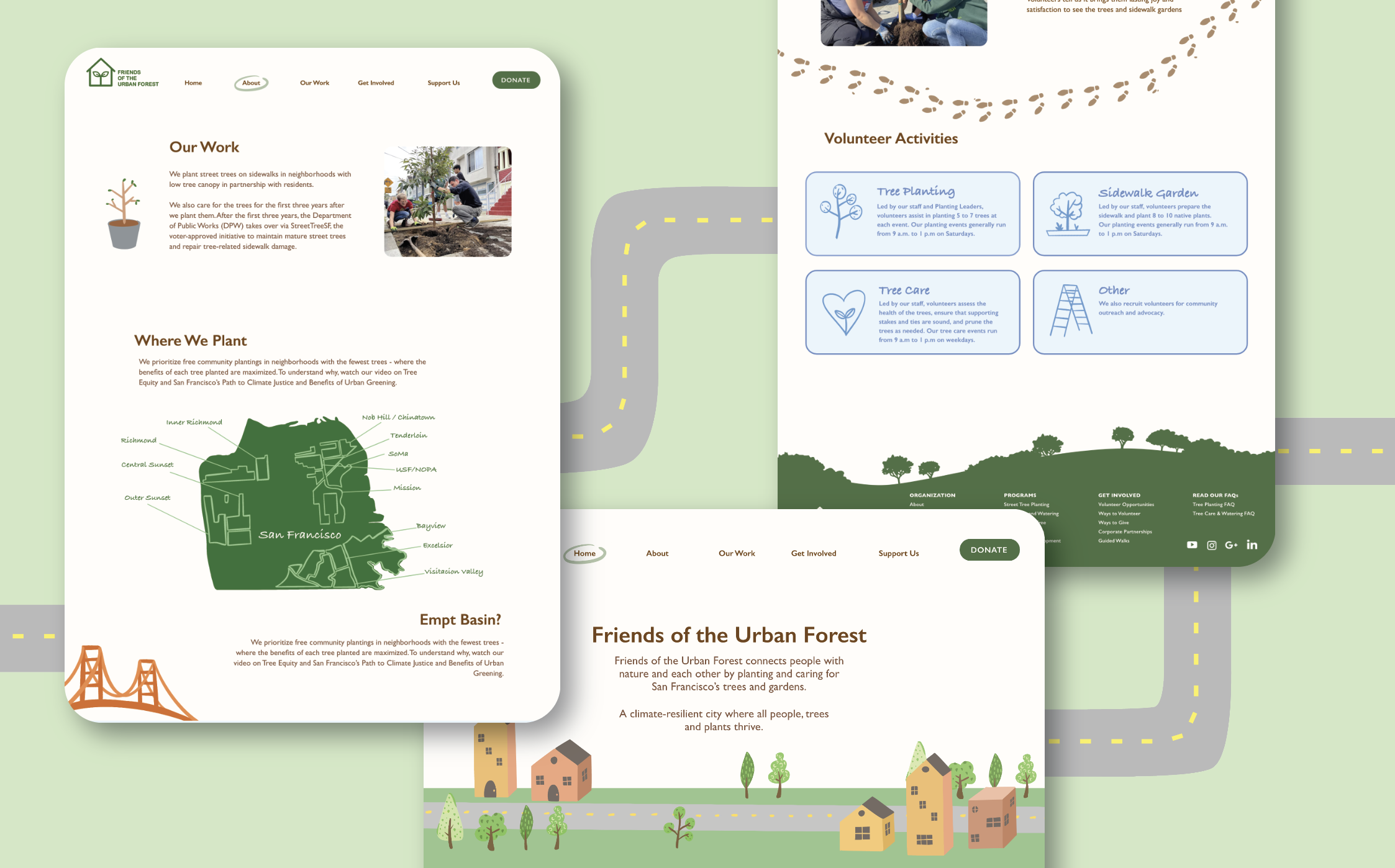
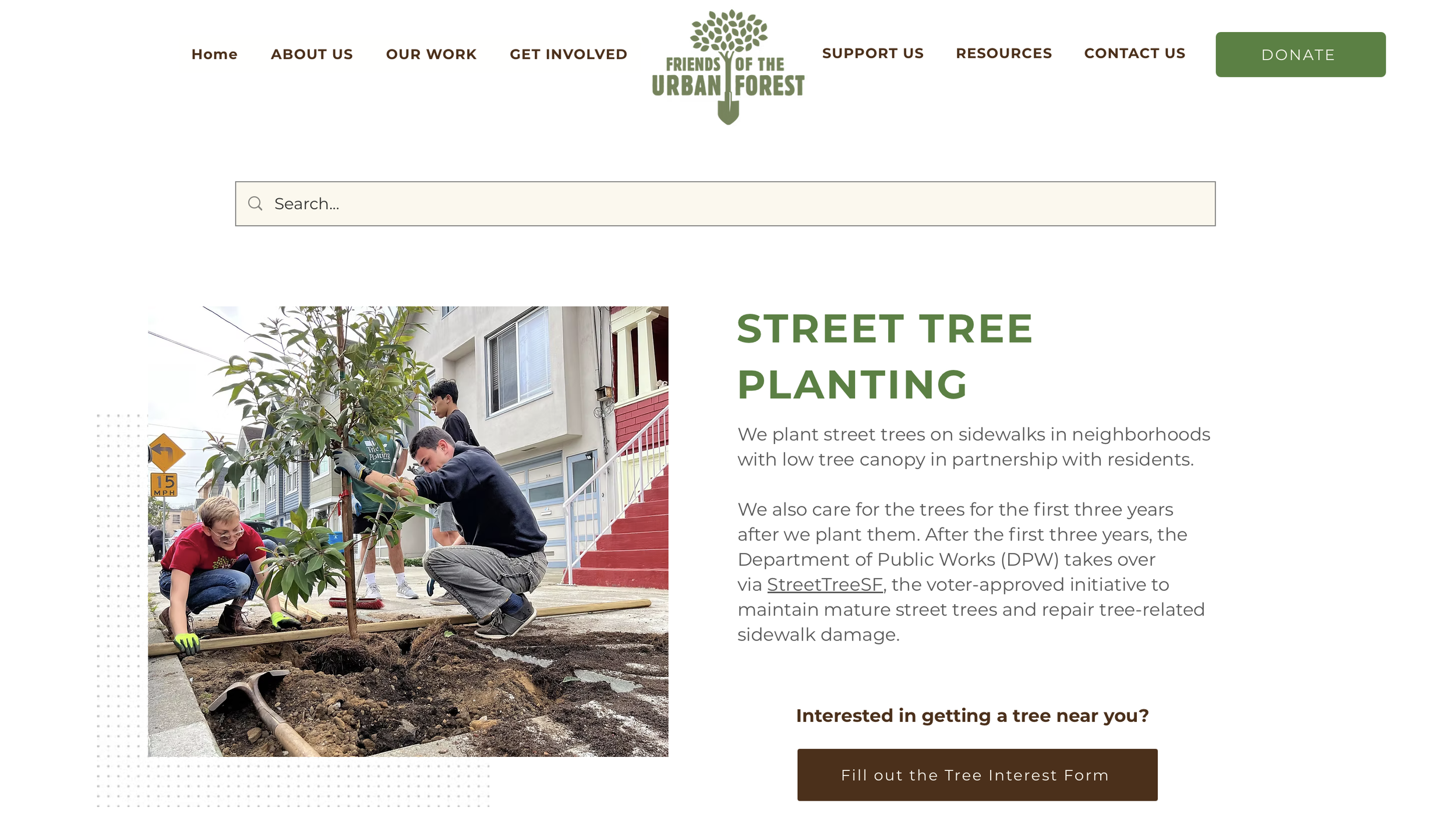
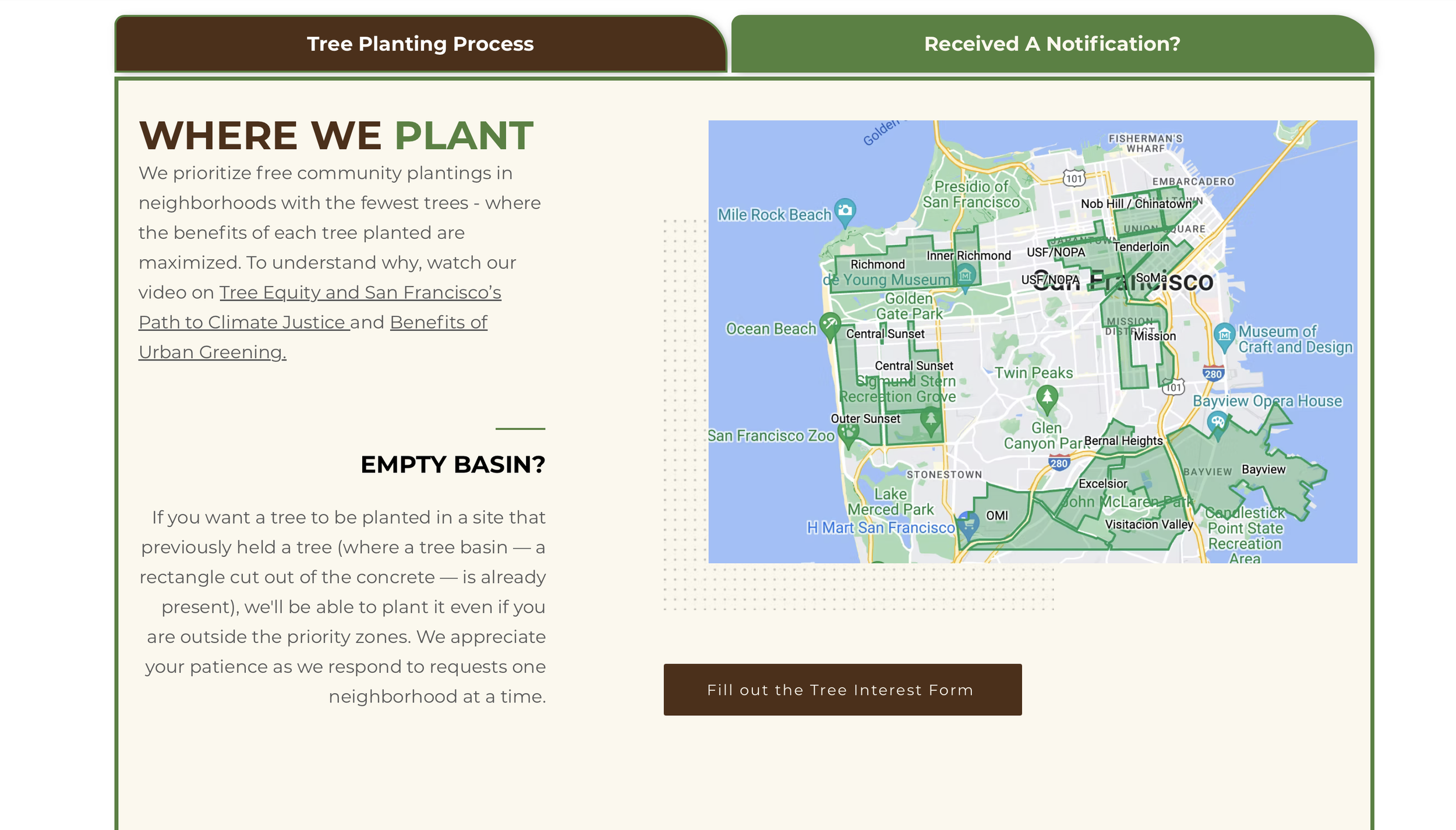
Current Friends of the Urban Forest Website
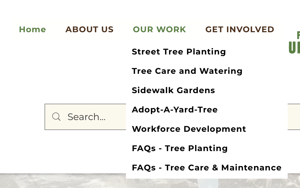
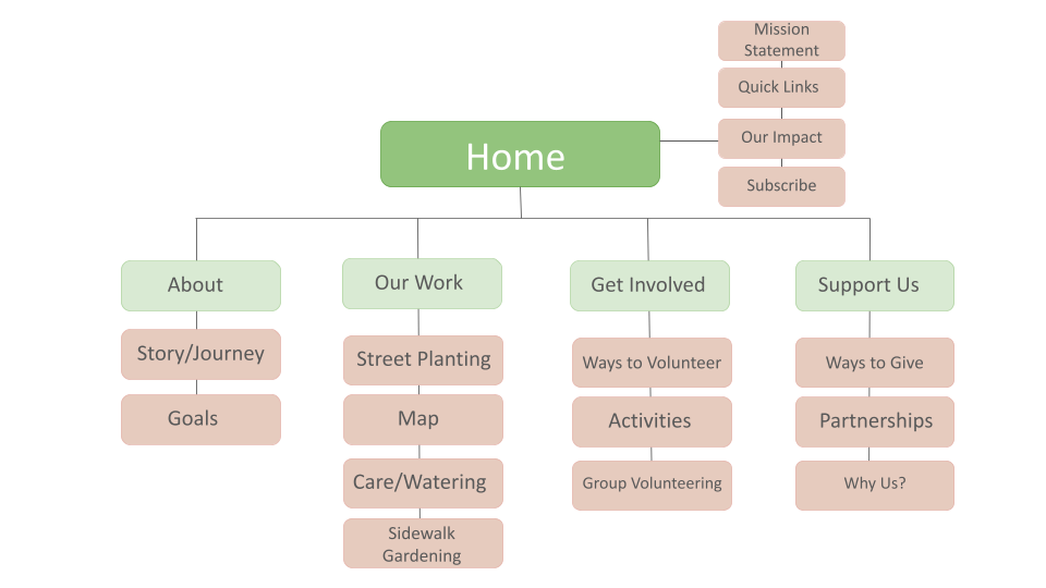
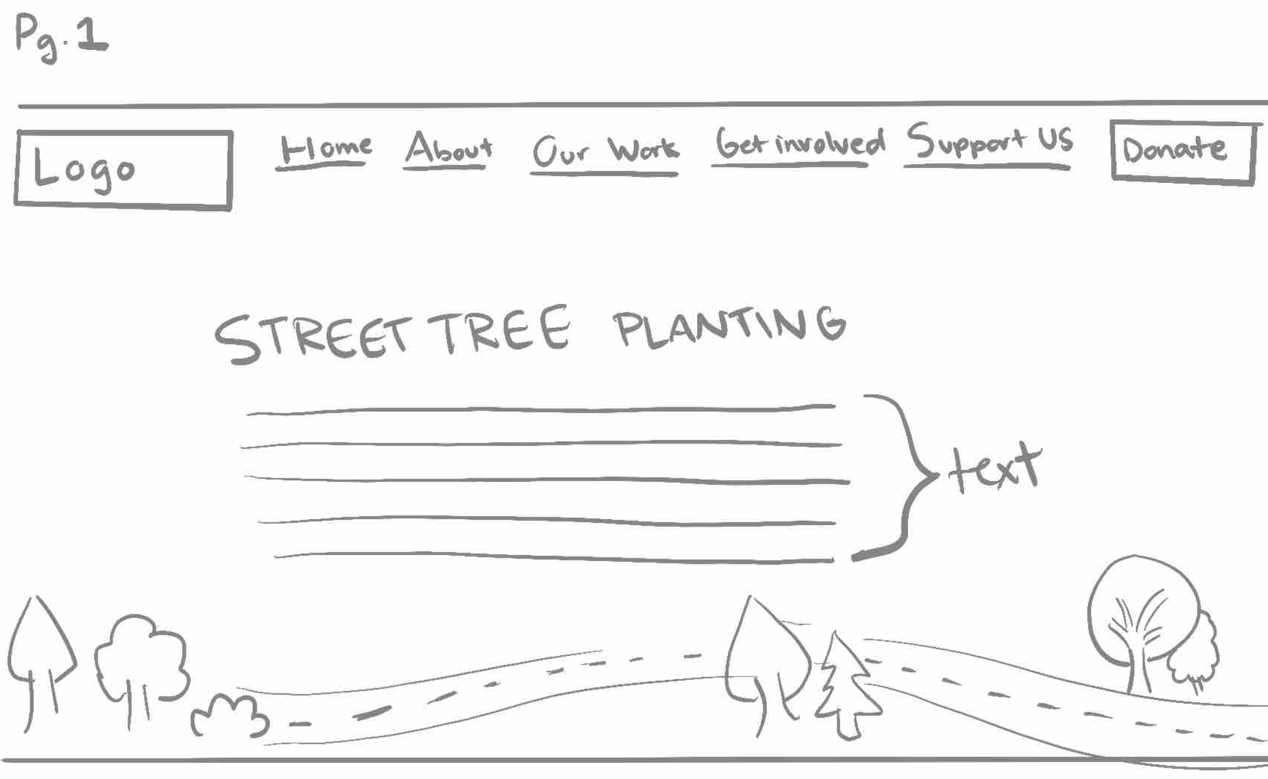
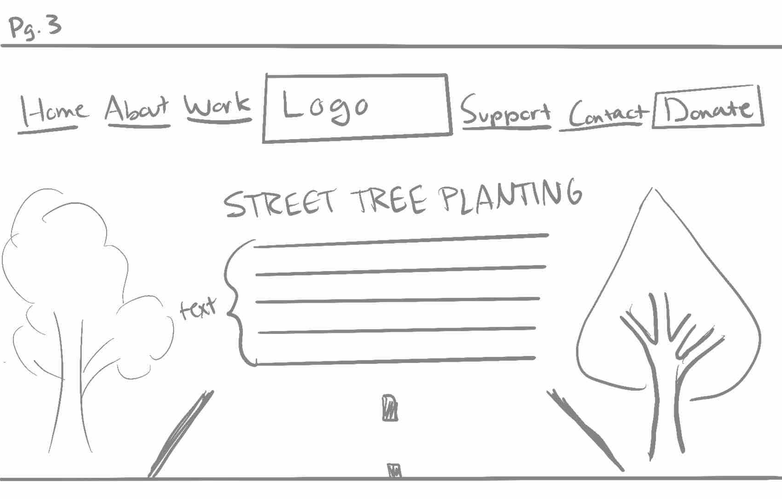
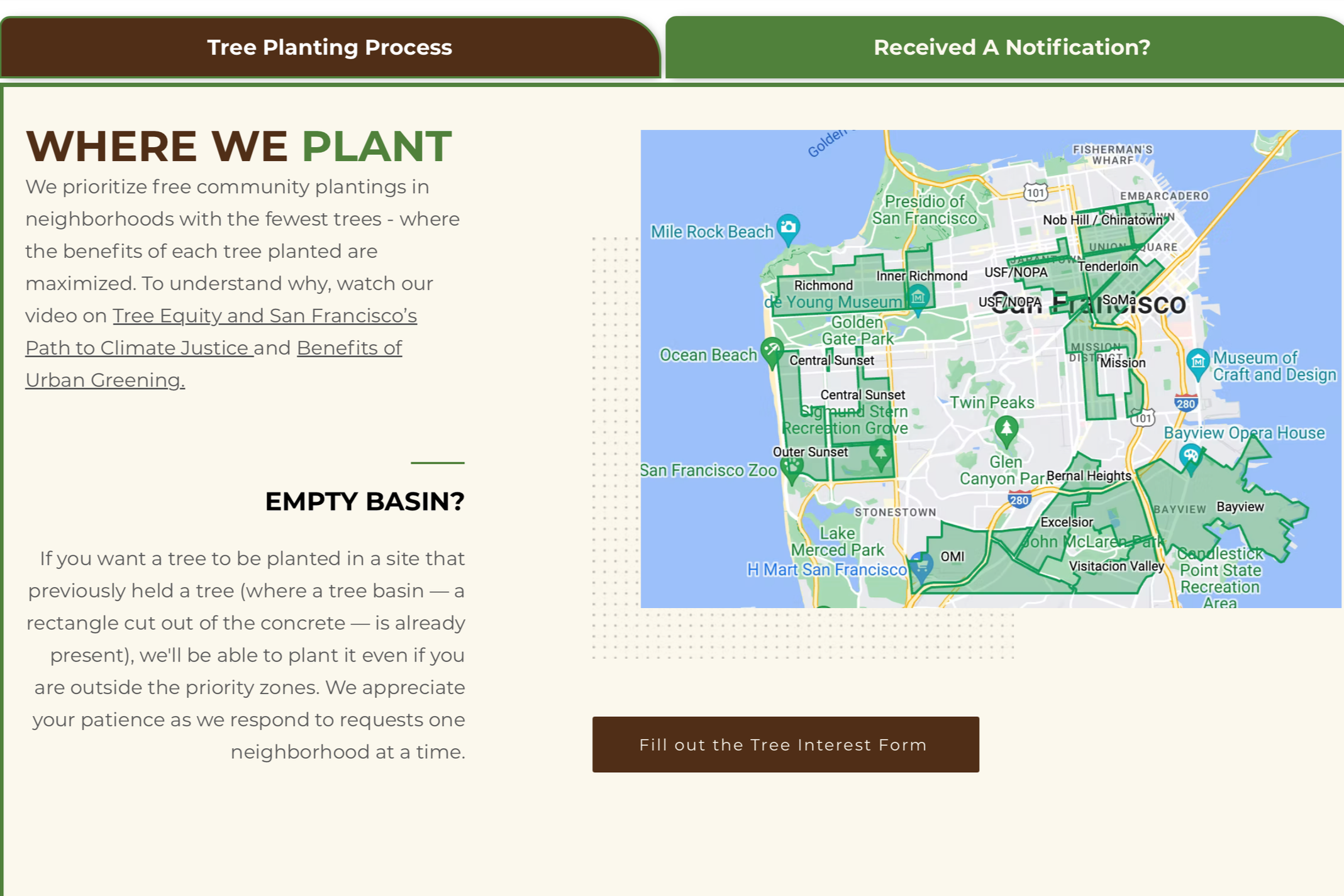
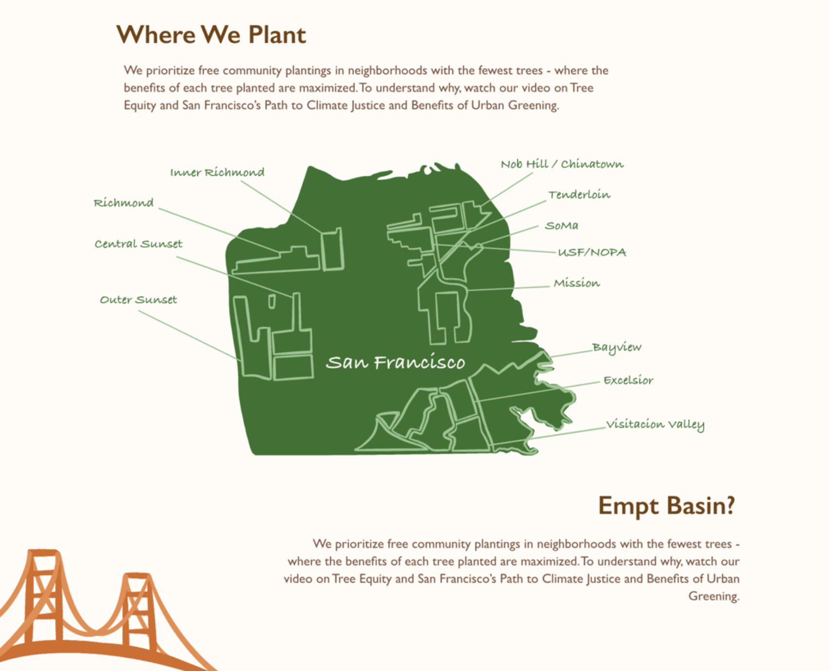
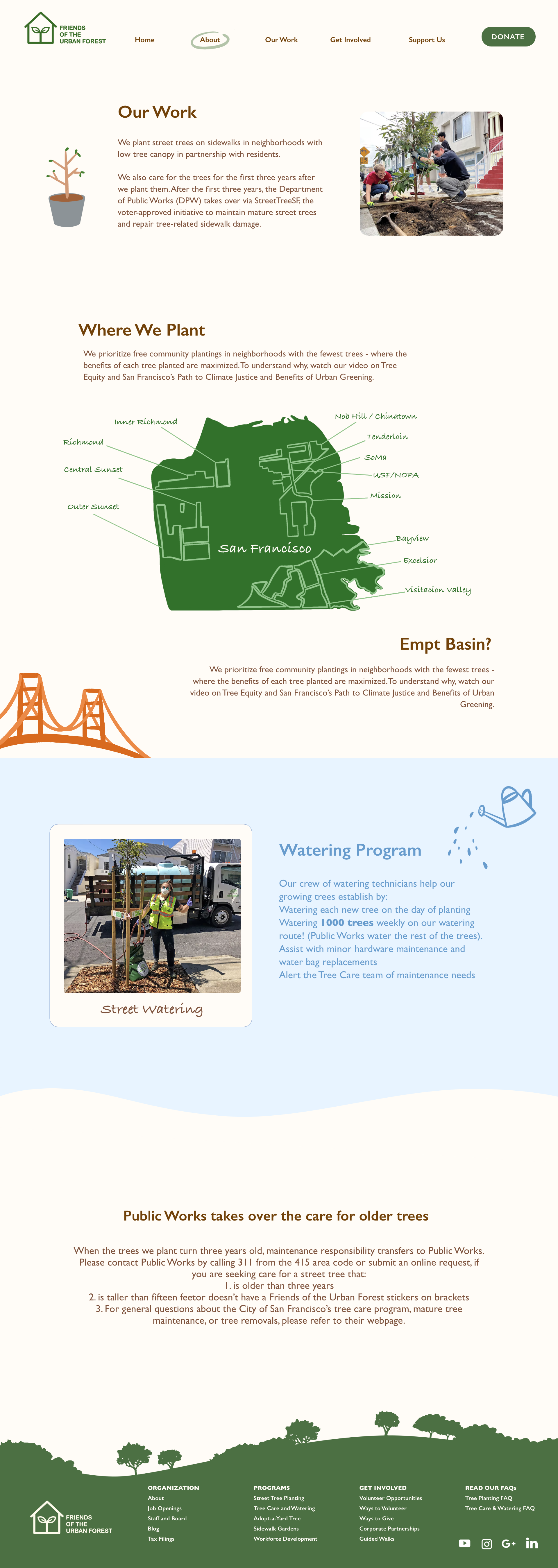
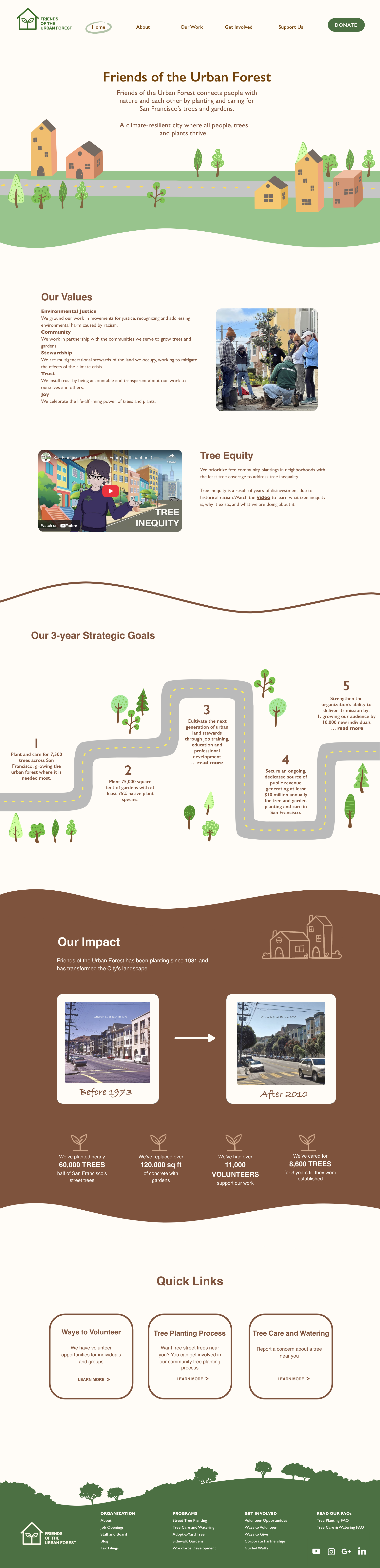
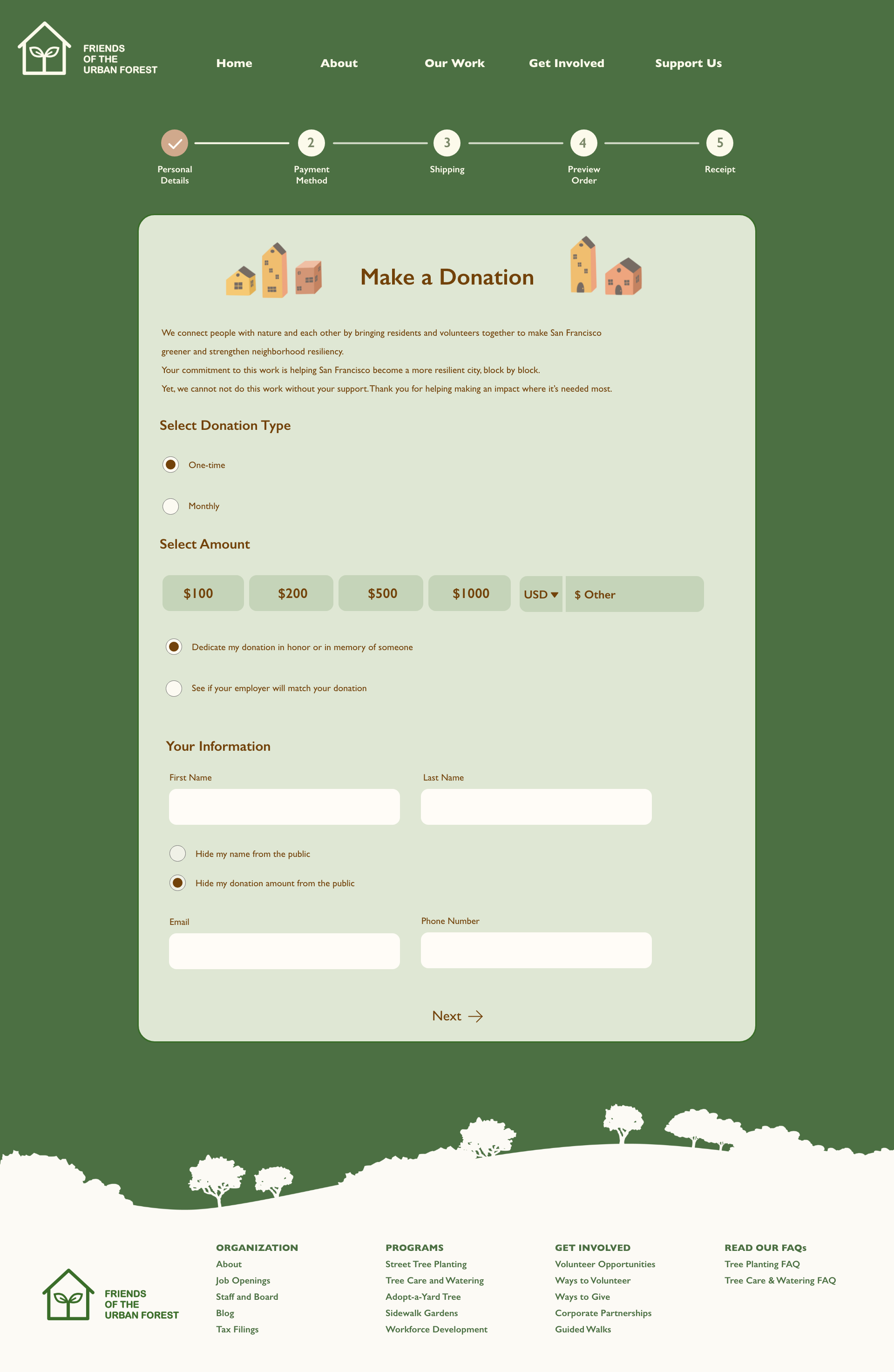
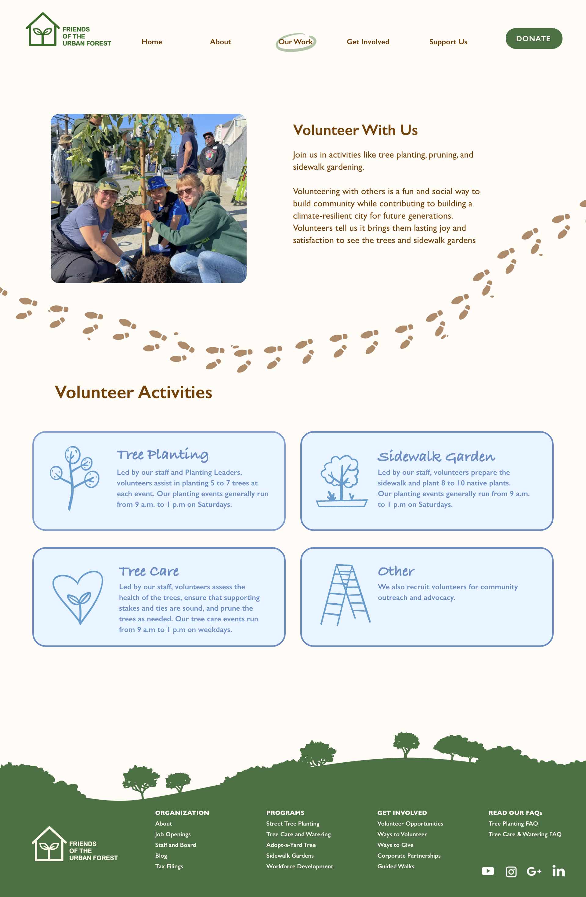
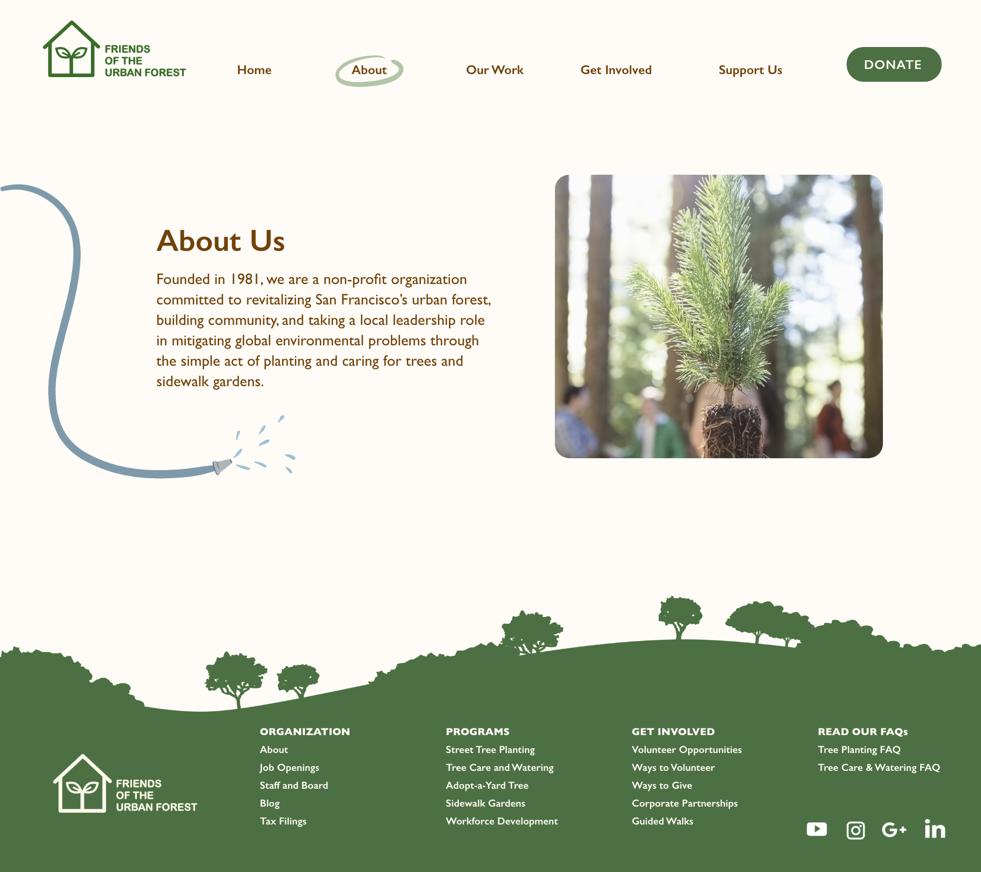
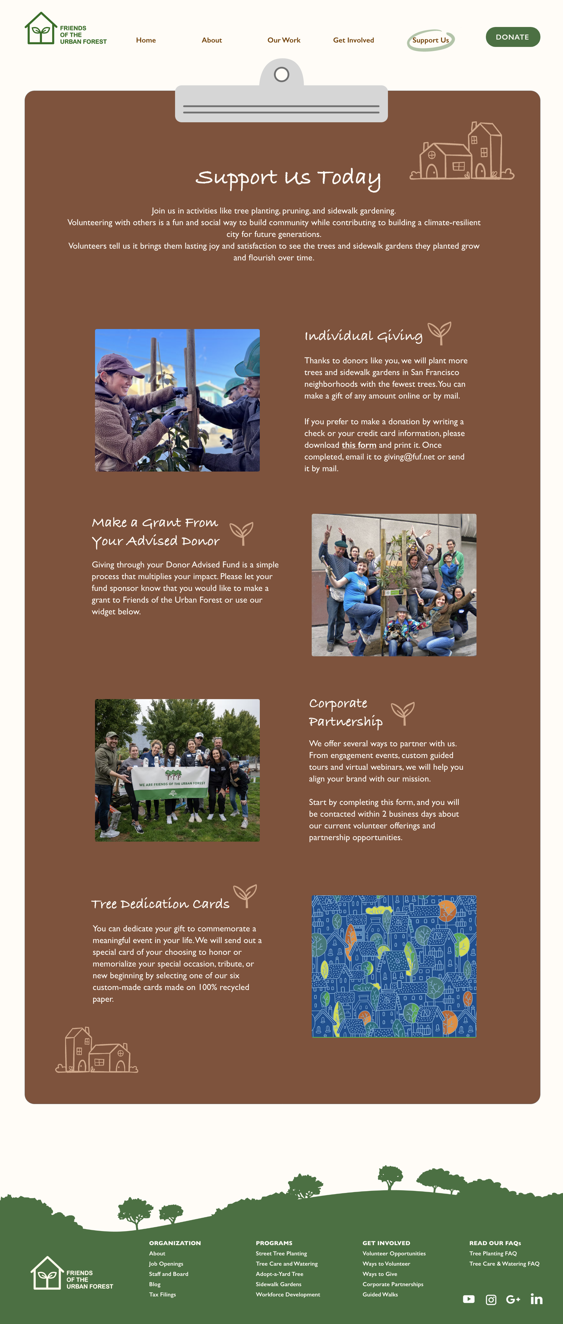
I redesigned the navigation menu with less headers and combined the tabs into single pages to avoid the user from needing to going back and forth between web pages.
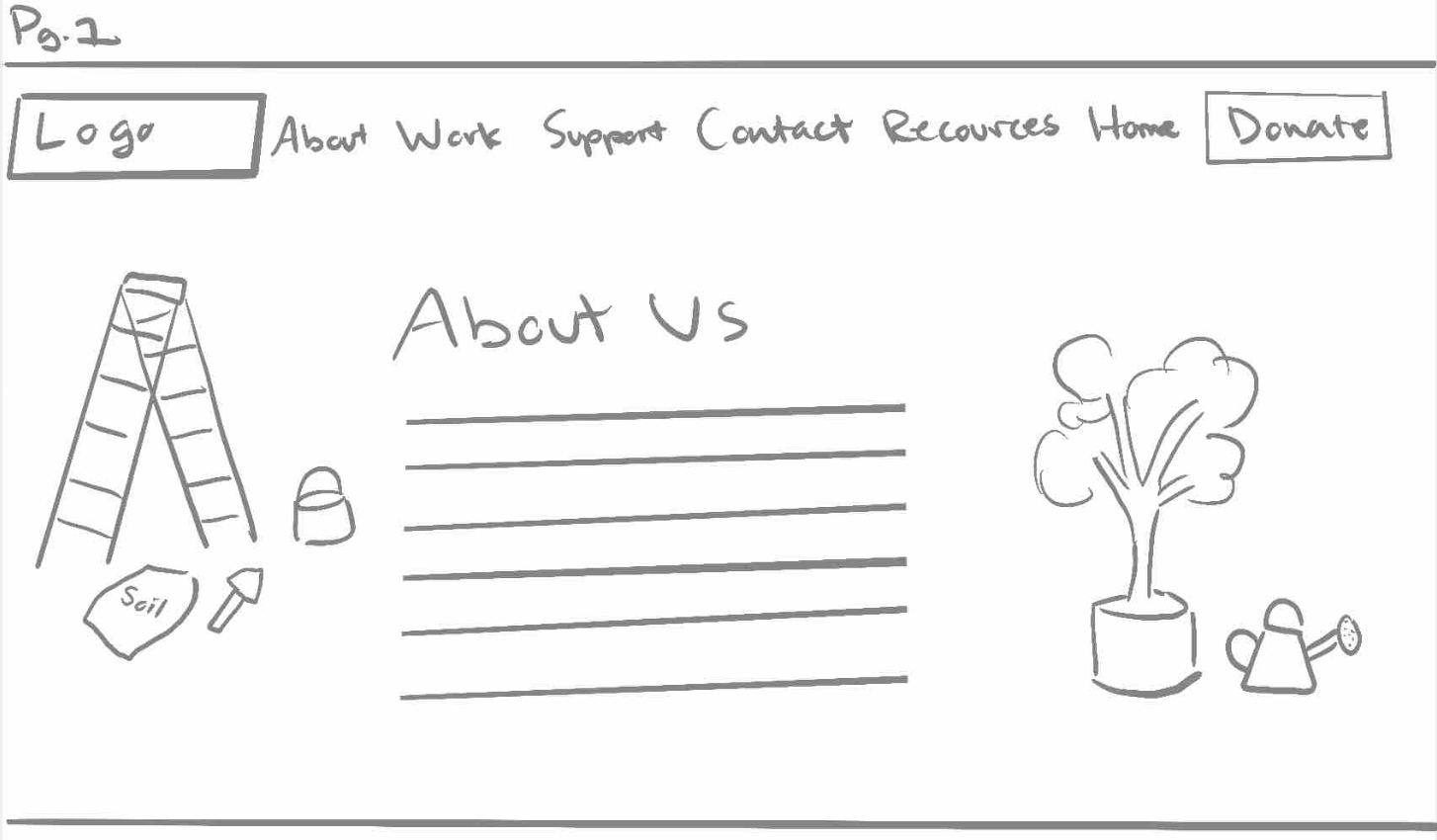
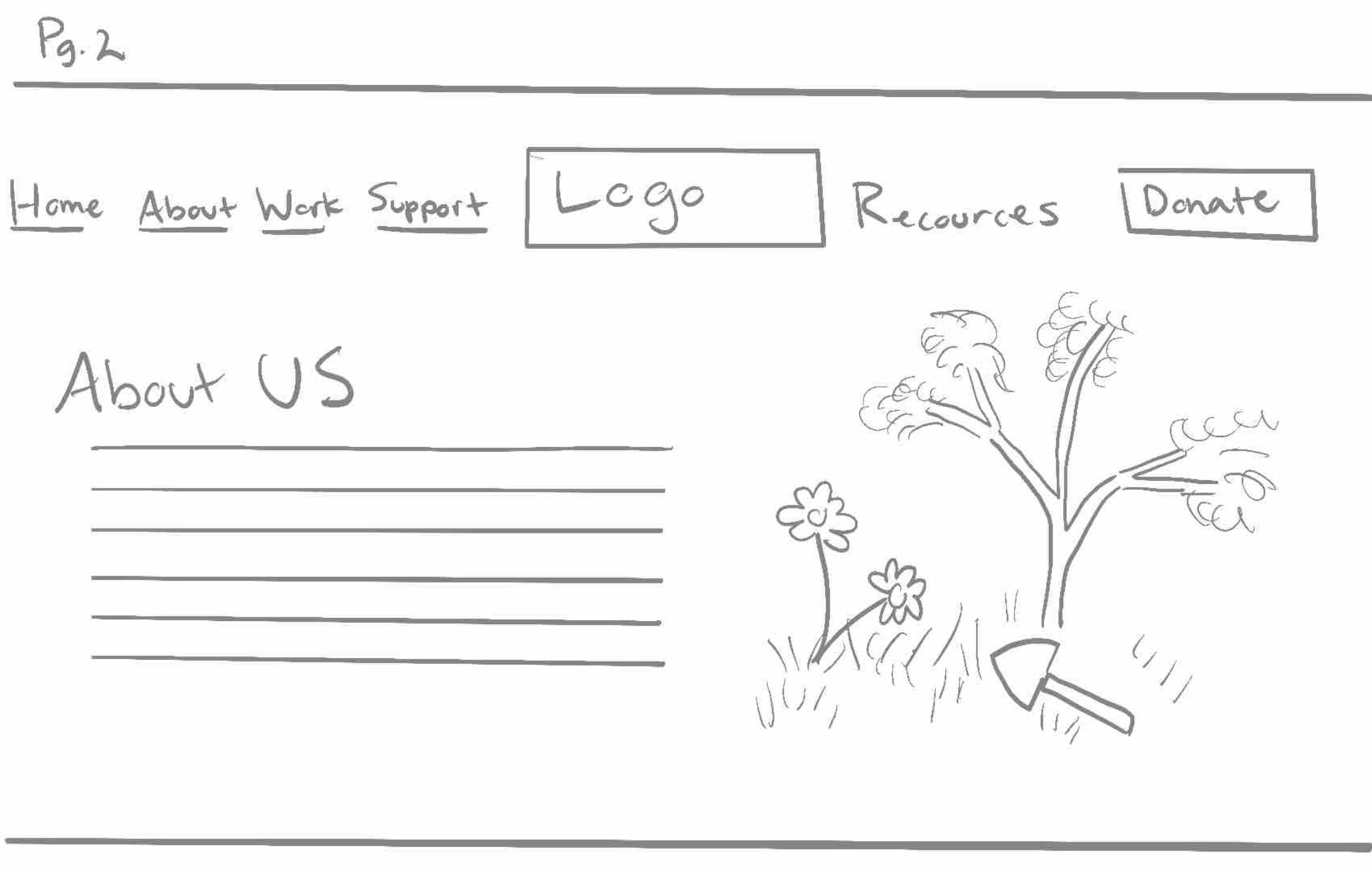
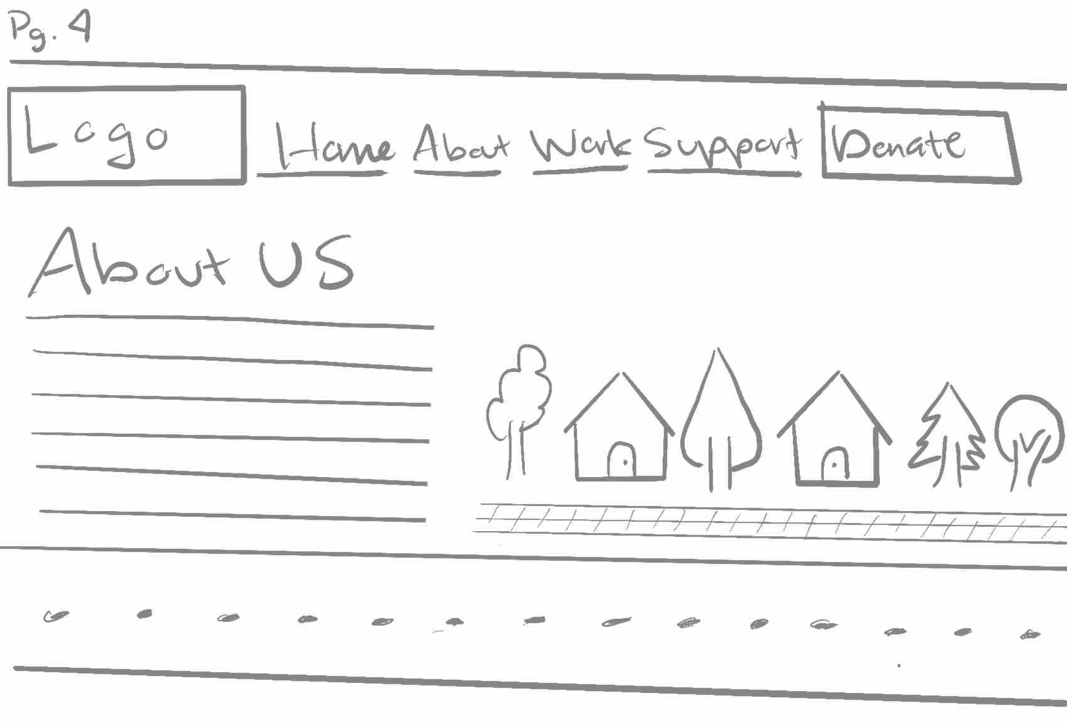
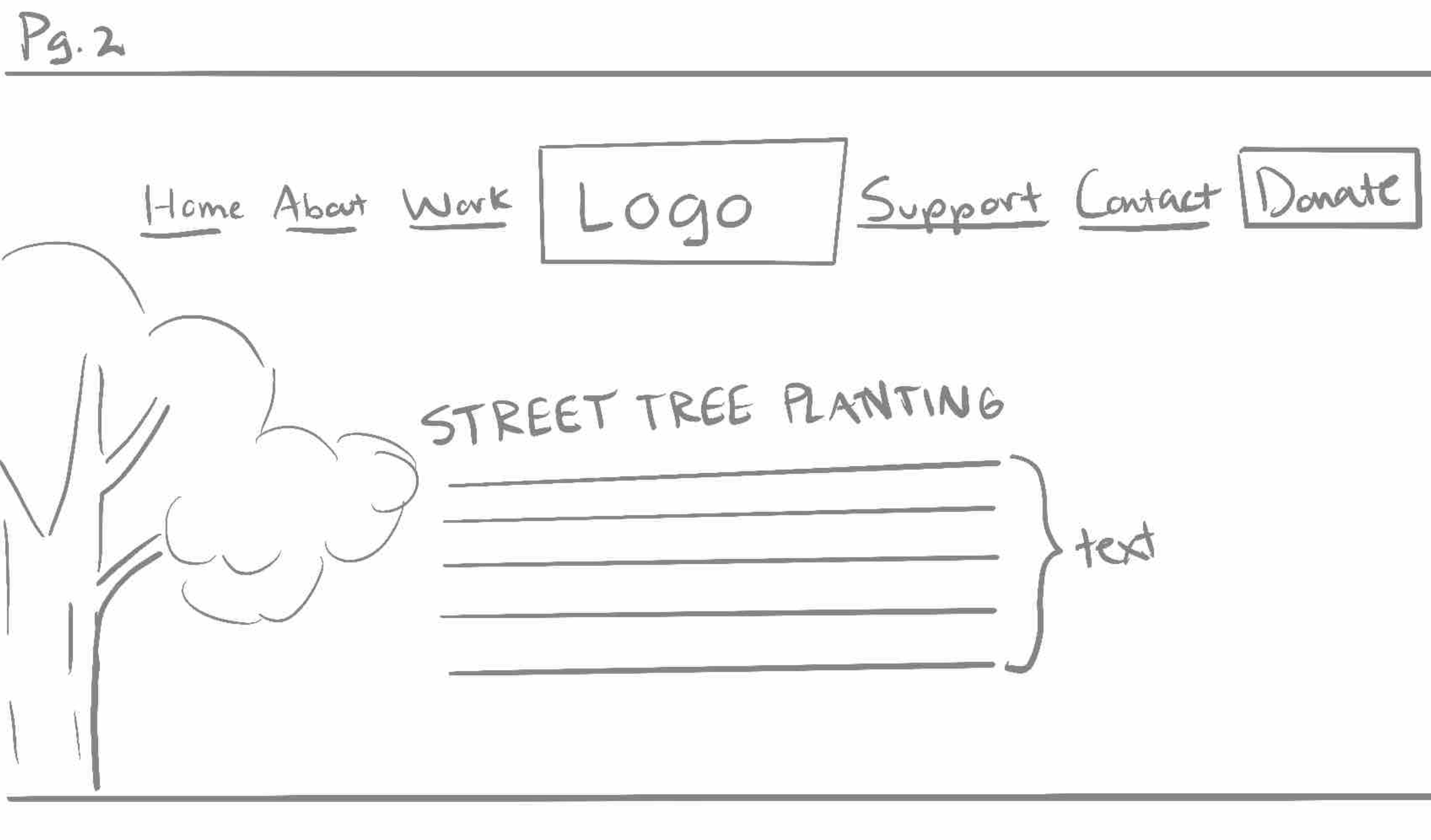
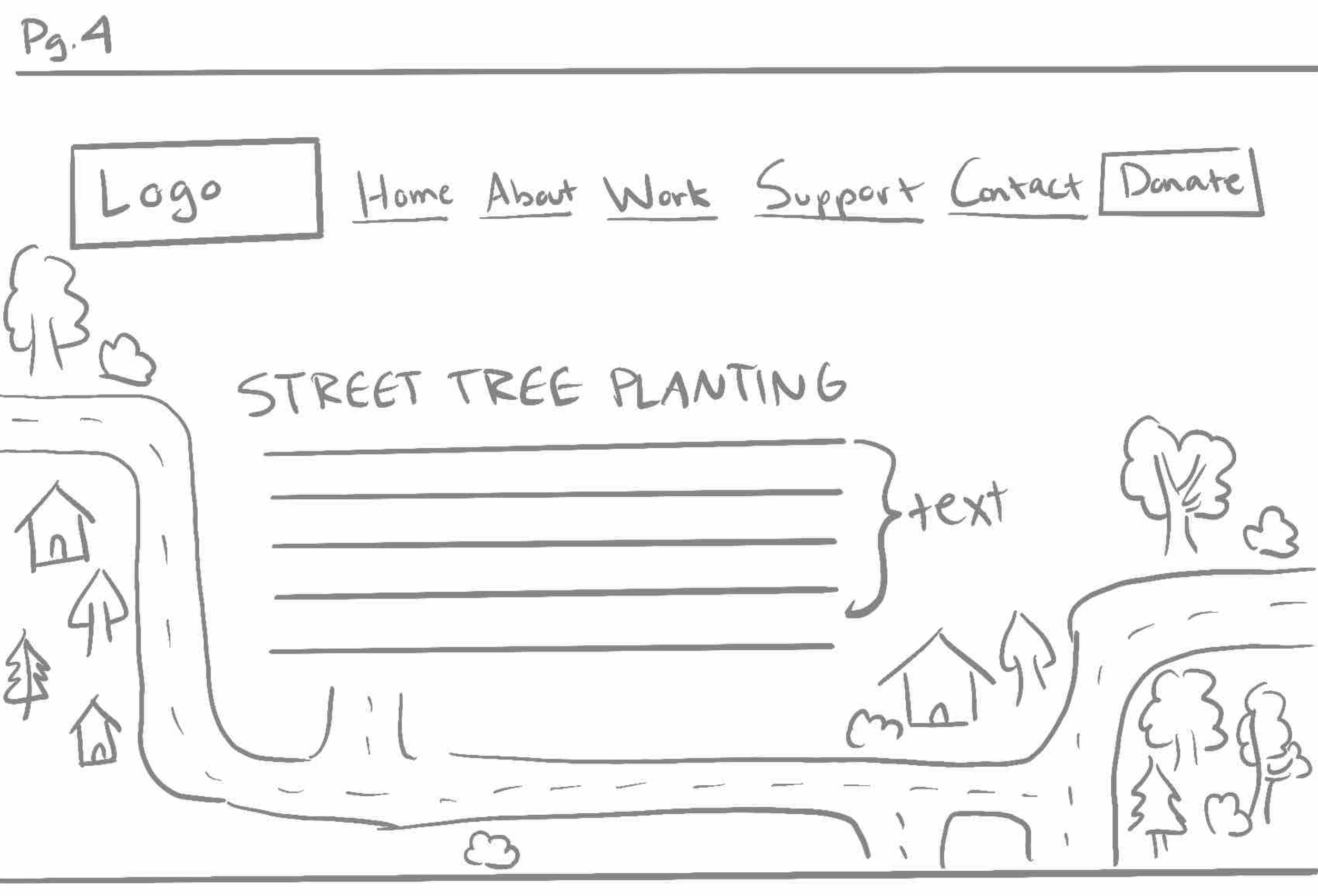
Wireframes Sketches
I started brainstorming ways of including more illustrations into some of the key pages of the site where people would most likely visit the most. I also experimented with different layouts of my navigation bar and seeing where logo should be placed.
“About Me” Page
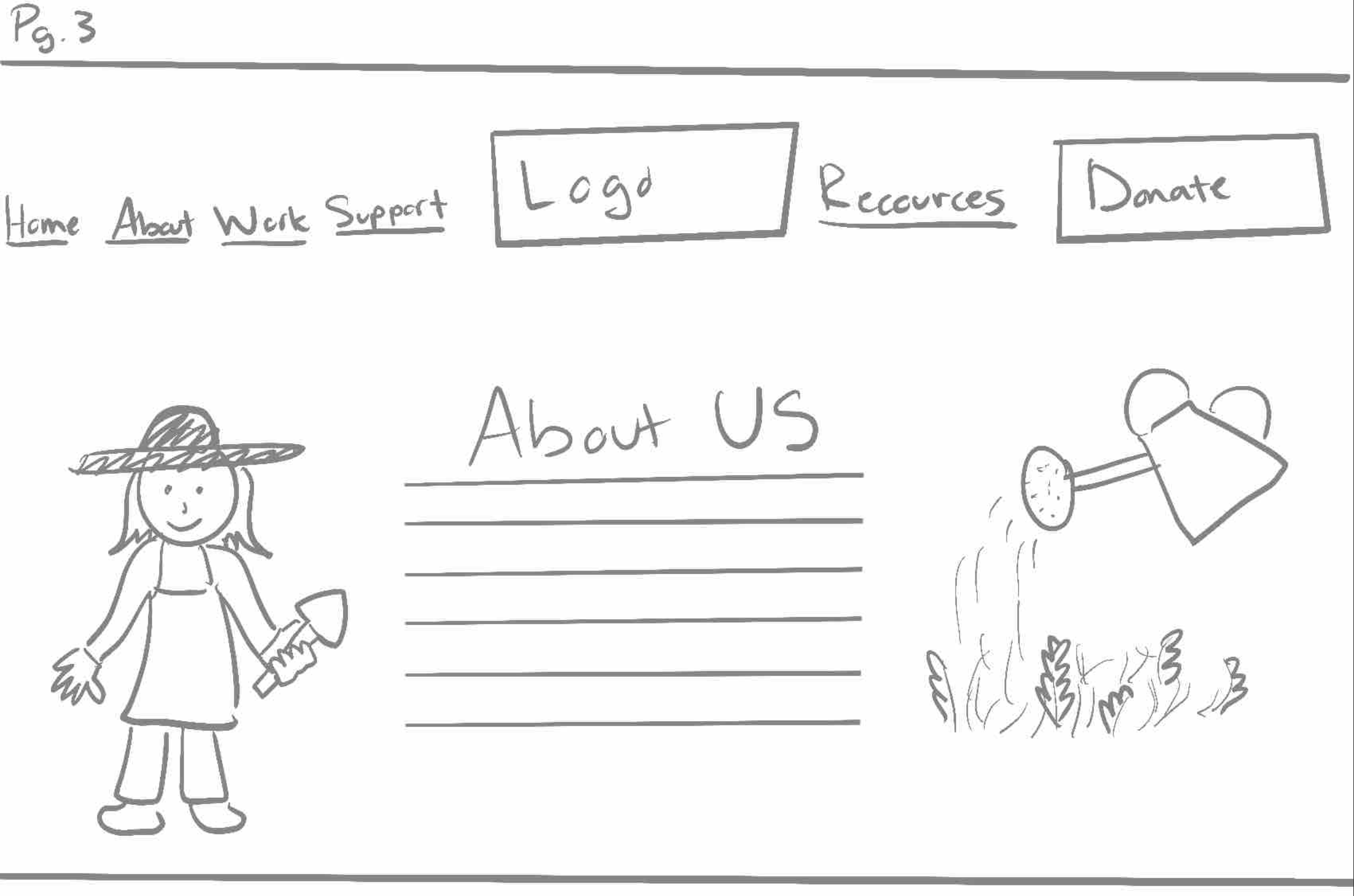
“Our Work” Page
Moodboard

DESIGN
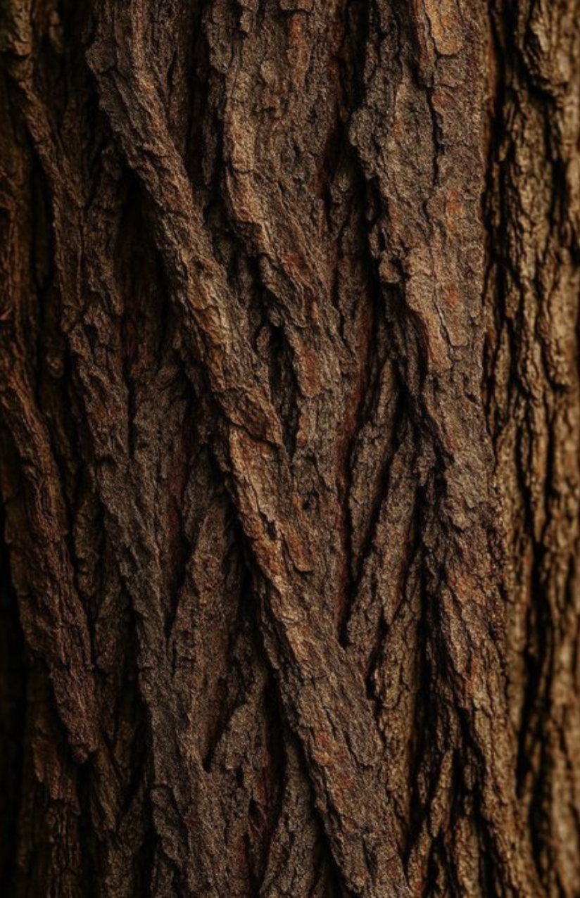
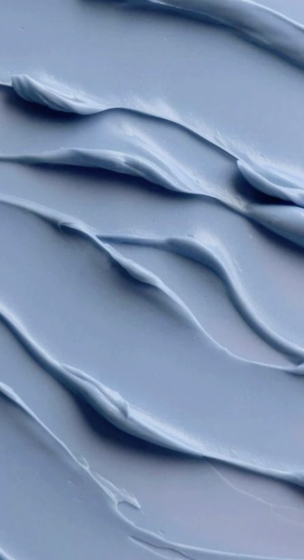
I drew inspiration from nature and organic shades of browns, greens, and blues.


An illustrative Touch

BEFORE (Left Images)
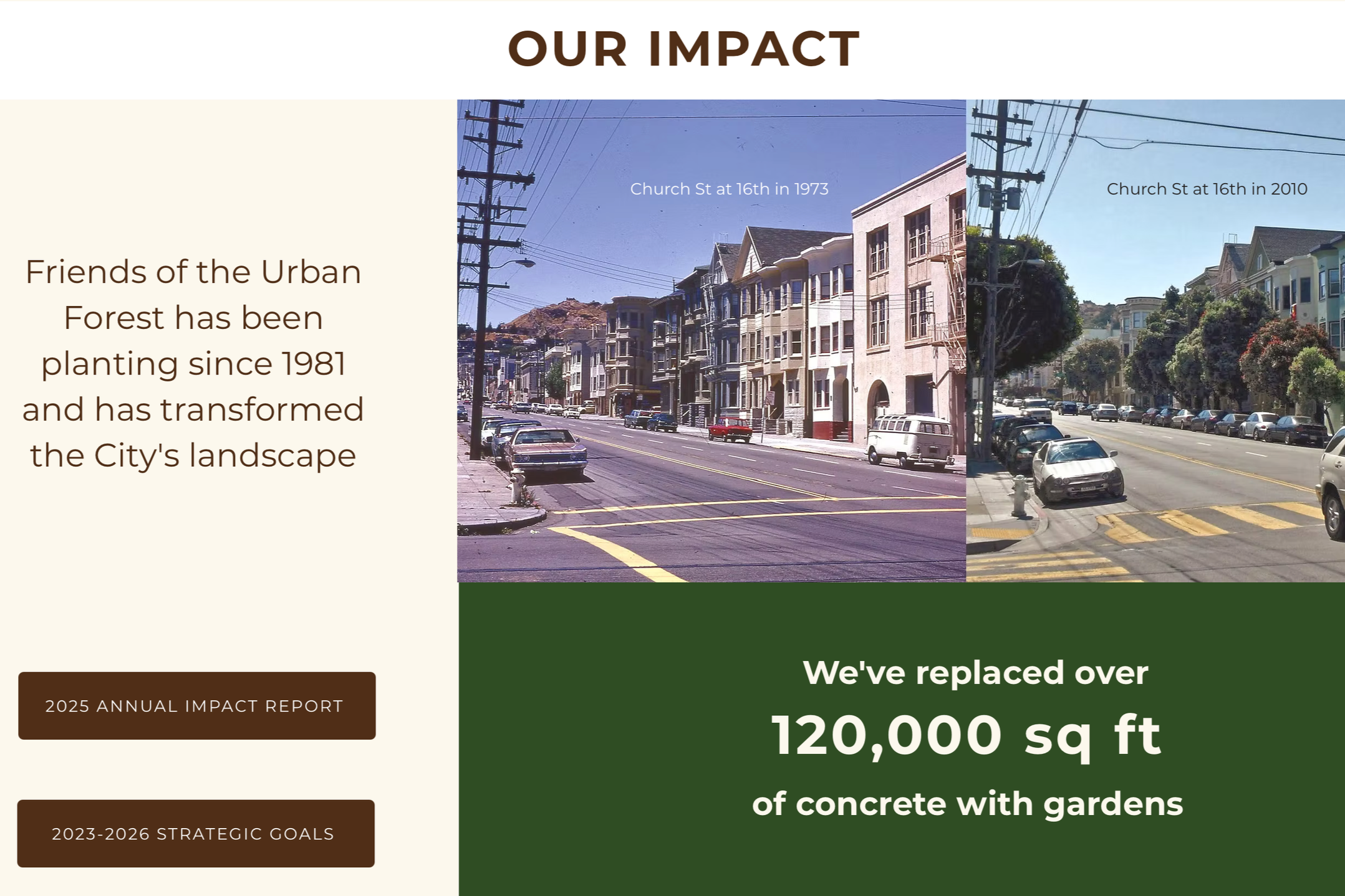
AFTER (Right Images)
REFLECTION
I learned that non-profits don’t always have to resemble a corporate design approach, and that it can actually be more beneficial to be playful and colorful with the design. Friends of the Urban Forest represents a vibrant community of determined volunteers that have fun together. I wanted to redesign their website to replicate that same feeling for others to experience virtually.
Thank you for checking out my work!
Purpose of Website
Target Audience
Typical User Task
New Site Structure
Final Wireframes
With the final prototype, users can get a sense of the in person experience online. With an illustrative approach, the website creates a more personal and warm community oriented feel. Emphasizing the earthy tones helps the user experience the lush greenery that Friends of the Urban Forest provides for their neighborhoods.